Analyse du design system

lecooktown.fr

lecooktown.fr is built on a dark canvas (rgb(51, 51, 51)). The system uses rgb(220, 165, 74) as the accent for primary actions and brand signals. Sharp 0px corners on CTAs — architectural restraint, engineering precision alongside Plus Jakarta Sans as the primary typeface. A restrained elevation system (2 distinct shadows) — shadows reserved for the few elements that must lift off the page. Motion is a first-class concern — 122 keyframe animations plus transition-driven interactions.

Accent #dca54a · police principale Manrope

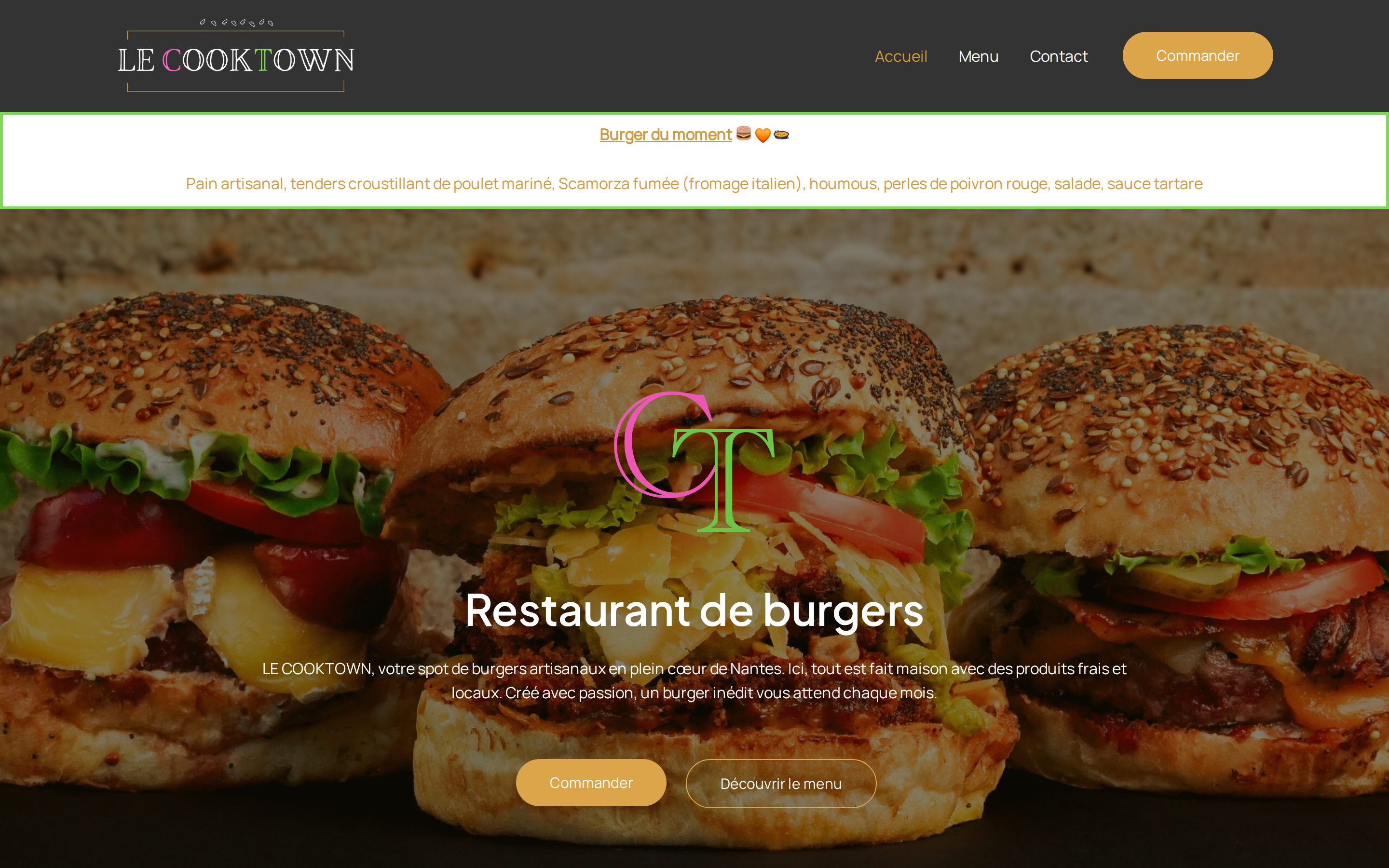
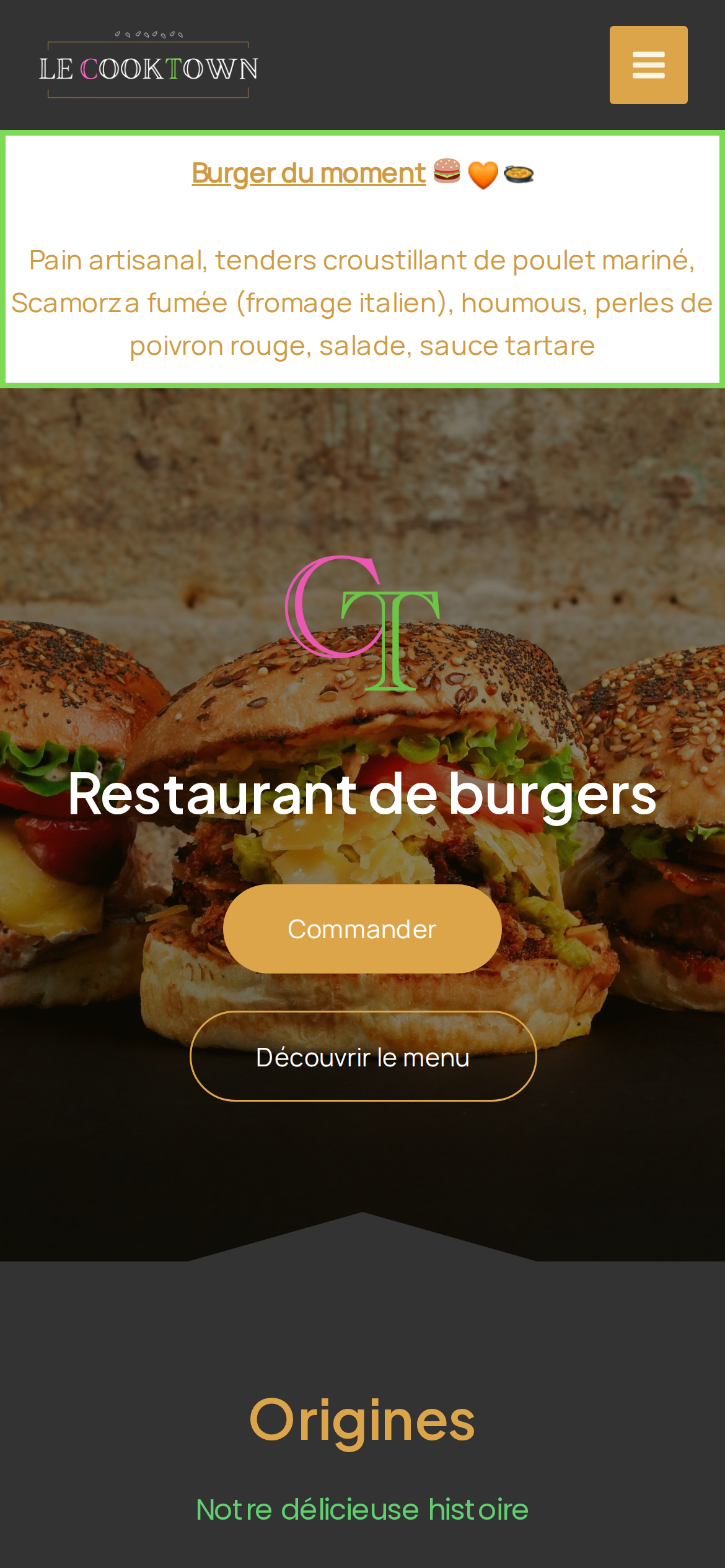
Chaque valeur ci-dessous est vérifiée à la capture. getdesign.md décrit — prismd montre : chaque couleur, police et courbe ici a été lue via getComputedStyle() sur le rendu réel capturé à droite, jamais affirmée à la main.

Rapport DESIGN.md complet · light & dark · fichiers tokens · Paiement non activé — on mesure la demande d’abord.
https://www.lecooktown.fr ·extrait le 2026-07-12 ·scorer v2 ·moteur getComputedStyle
Desktop · source de vérité
lecooktown.fr desktop
Mobile
lecooktown.fr mobile
01

Couleurs — rôles, sémantique & recensement complet

11 couleurs mesurées · clique une pastille pour copier

Canvas
#333333
AA 5.04:1
Ink
#d09a40
AA 5.04:1
Accent
#dca54a
AA 5.73:1
Line
#ffffff
AAA 12.63:1
États sémantiques

Aucune couleur d’état sémantique détectée — ce système signale l’état par le poids & le motion, pas la teinte.

11 couleurs extraites du rendu livedéplier
02

Typographie — l’échelle, dans la vraie police

5 rôles · rendu live dans la vraie Manrope (woff2 capturé) · lignes éditables, clique une spec pour copier

display xl
display-xl100px · 600
display md
display-md30px · 600 · ×3.33
headline
headline24px · 400 · ×1.25
body
body15px · 400 · ×1.60
button
button24px · 400 · ×0.63
03

Espacements & arrondis, rendus spatiaux

9 paliers d’espacement · 7 arrondis · barres = largeurs px exactes

Échelle d’espacement
xxs · 2px
xs · 4px
sm · 8px
md · 12px
base · 20px
lg · 24px
xl · 29px
2xl · 50px
3xl · 58px
Arrondis
none
0px
xs
2px
sm
50px
md
58px
lg
66px
xl
74px
full
9999px
04

Profondeur — l’élévation est extraite, pas inventée

2 ombres mesurées sur la page live · clique une tuile pour copier sa valeur brute

shadow-1
shadow-2
05

Motion — courbes, transitions & keyframes réels

1 courbe d’easing · 122 keyframes · survole une tuile pour prévisualiser

Courbes & transitions
transition-1linear
122 animations keyframes extraites
statusIconPop
selectedSlotCheckmark
latepointFadeUp
up10op
up10
up20op
rotateScale
up20
up40
latepointMessage
latepointFadeDown
osLightboxAnimation
06

Composants — le vocabulaire fermé

13 familles de composants · 34 variantes comptées sur le DOM live

ComposantVariantes
links×10
heading H2×5
buttons×3
nav Links×3
badges×2
footer Links×2
heading H4×2
divider×2
cards×1
status Badge×1
heading H1×1
heading H3×1
heading H6×1
Specs de style des composants (§4)déplier

Buttons

Primary Brand

  • Background: #dca54a {colors.primary}
  • Text: #faf5e5
  • Padding: 12px
  • Radius: 2px
  • Font: 24px weight 400
  • Use: Primary CTA / brand action
  • Focus: outline: rgb(126, 217, 87) dotted 2px

Pill

  • Background: #dca54a {colors.primary}
  • Text: #ffffff {colors.hairline}
  • Padding: 17px 35px
  • Radius: 50px
  • Font: 15px weight 400
  • Use: Status pills, tags, chips
  • Focus: outline: rgb(126, 217, 87) dotted 2px

Pill

  • Background: transparent
  • Text: #ffffff {colors.hairline}
  • Padding: 17px 35px
  • Radius: 50px
  • Border: 1px solid rgb(220, 165, 74)
  • Font: 15px weight 400
  • Use: Status pills, tags, chips
  • Focus: outline: rgb(126, 217, 87) dotted 2px

Icon Button

  • Background: #faf5e5
  • Text: #0f172a
  • Padding: 10px
  • Radius: 0px
  • Font: 16px weight 400
  • Use: Toolbar/UI icons
  • Focus: outline: rgb(126, 217, 87) dotted 2px
07

Mise en page — structure & dimensions

5 métriques de layout mesurées

header 116px 1200px max-width
max Width1200px
header Height116px
sidebar Width0px
gap16px
container Padding0px
08

Responsive — vrais breakpoints

34 points de rupture lus dans le CSS live

420px
421px
479px
480px
500px
544px
576px
599px
600px
601px
767px
768px
769px
782px
800px
900px
921px
922px
959px
960px
976px
991px
992px
993px
1024px
1025px
1050px
1199px
1200px
1201px
1270px
1310px
1366px
1415px
09

À faire / À éviter

21 règles applicables, verbatim de la spec

À faire
Use dark background (`#333333`) as the foundation — this is a dark-mode-native design
Use Charcoal (`#333333`) for text — not pure black, it's warmer and more readable
Use Manrope as the primary typeface — it defines the brand personality
Keep font weights between 400-600 — the system uses a narrow weight range for subtle hierarchy
Use the extracted shadow patterns for elevation — they are tuned to match the brand palette
Use Honey (`#dca54a`) as the primary accent — it's the brand's signature interactive color
Use 50px border-radius on primary buttons — the brand uses generously-rounded CTAs
Maintain nav height at 70px — consistent vertical space for the navigation bar
Each card includes a top image — imagery is part of the card identity, not optional
Use a 4-column grid on desktop — density matters for this content type
À éviter
Don't use light backgrounds — the dark canvas is the native medium
Don't use pure black (`#000000`) for text — the near-black adds warmth
Don't substitute with generic sans-serif or serif — the custom font carries the brand
Don't reach for weight 700 (bold) or above — 600 is the heaviest weight this design paints
Don't invent new shadow values — use only the extracted shadow levels
Don't introduce additional saturated accent colors — the palette is intentionally controlled
Don't use sharp-cornered or pill buttons — 50px is the CTA border-radius standard
Don't collapse or hide the nav on scroll without an explicit scroll-triggered animation — the design uses fixed nav presence
Don't make the nav sticky — this design lets it scroll away to maximize content focus
Don't put a CTA button in the nav — this design uses links only at the top
Don't over-build the footer — this design keeps it minimal (1 cols, 5 links)
10

Guide agent & export

Prompt prêt à coller + les vrais fichiers derrière cette page

Construis une UI dans le design system de lecooktown.fr. Fond #333333 · encre #d09a40 · accent #dca54a. Typo : Manrope — respecte l’échelle taille/graisse du §3. Arrondis, espacements, ombres : uniquement les échelles extraites (aucun nombre magique). La spec complète suit — colle le DESIGN.md ci-dessous dans ton agent.
Chaque valeur ci-dessus est vérifiée par getComputedStyle.
$ npx prism-design add lecooktown
DESIGN.md · narrative spec tokens.json