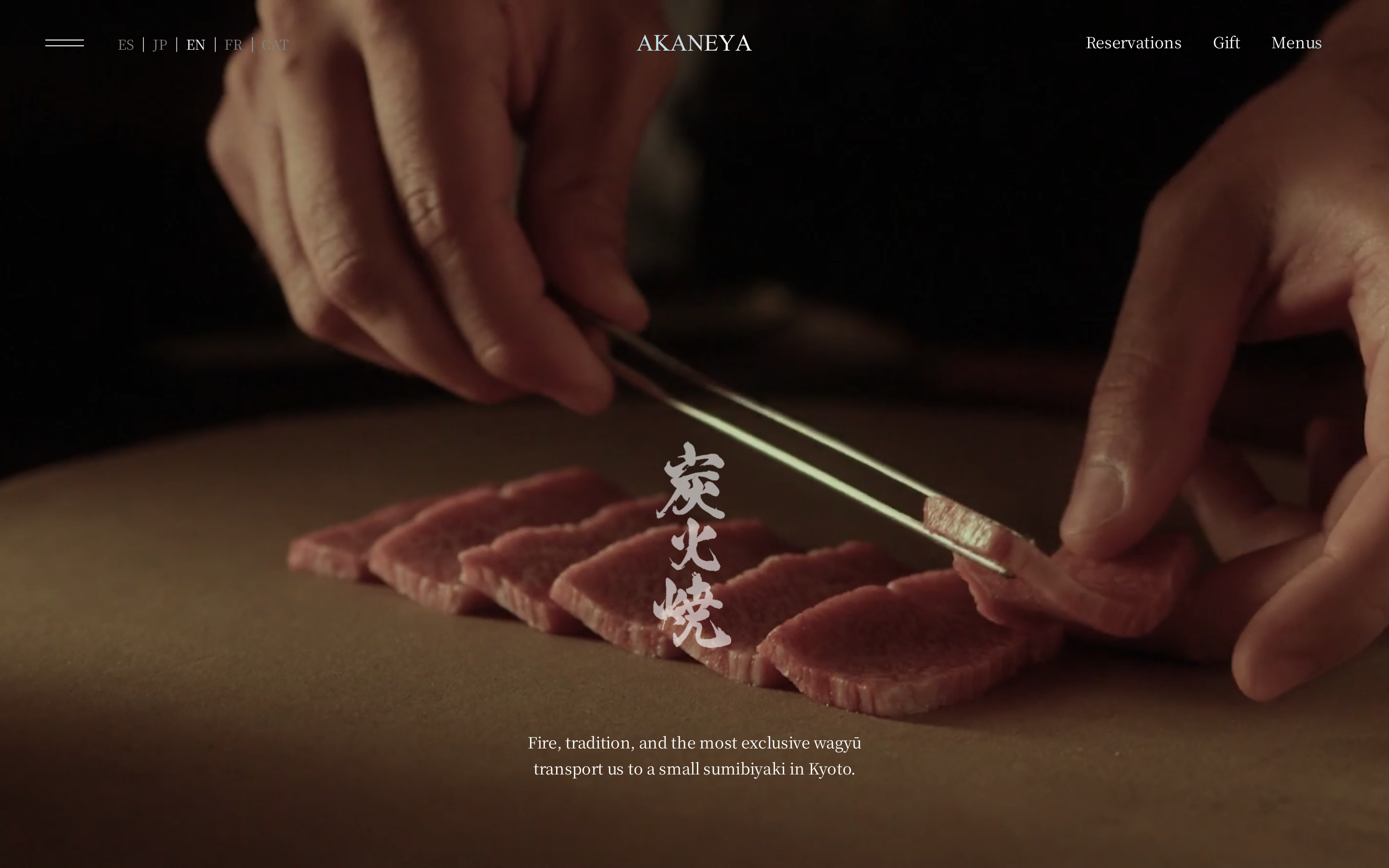
akaneyajapan.com is built on a warm, off-white canvas (rgb(255, 252, 249)).
The system uses rgb(186, 105, 61) as the accent for primary actions and brand signals.
Editorial serif type (Noto Serif JP) — voice of authority.
Depth comes from borders and surface contrast rather than shadows — a flat, structural elevation model.
Interactions are smoothed by transitions across many elements, with little or no keyframe animation.
Accent #ba693d · police principale Noto Serif JP
Chaque valeur ci-dessous est vérifiée à la capture. getdesign.md décrit — prismd montre : chaque couleur, police et courbe ici a été lue via getComputedStyle() sur le rendu réel capturé à droite, jamais affirmée à la main.
Rapport DESIGN.md complet · light & dark · fichiers tokens · Paiement non activé — on mesure la demande d’abord.
2 courbes d’easing · 0 keyframes · survole une tuile pour prévisualiser
Courbes & transitions
transition-1cubic-bezier(0.16, 1, 0.3, 1)
ease-outcubic-bezier(0.050,0.760,0.380,1.015)
Keyframes
Transitions seules — aucune @keyframes sur cette page. Le motion vit entièrement dans les courbes d’easing à gauche.
06
Composants — le vocabulaire fermé
4 familles de composants · 19 variantes comptées sur le DOM live
Composant
Variantes
links
×8
nav Links
×7
badges
×3
footer Links
×1
07
Mise en page — structure & dimensions
5 métriques de layout mesurées
max Width1200px
header Height88px
sidebar Width0px
gap16px
container Padding24px
08
Responsive — vrais breakpoints
3 points de rupture lus dans le CSS live
1025px
1100px
1101px
09
À faire / À éviter
14 règles applicables, verbatim de la spec
À faire
Use Pure White (`#fffcf9`) as the page background — it's intentionally not pure white
Use Noto Serif JP as the primary typeface — it defines the brand personality
The system uses a single text weight (400) — hierarchy comes from size and color, not weight
Use Terracotta (`#ba693d`) as the primary accent — it's the brand's signature interactive color
Respect the 8px–79px spacing range — the design uses a wide scale for visual breathing room
Make the navigation fixed — it stays visible during scroll, signaling content depth
Each card includes a top image — imagery is part of the card identity, not optional
Use a 3-column grid on desktop — density matters for this content type
À éviter
Don't use pure white (`#ffffff`) as a page background — the warm tone is part of the brand identity
Don't substitute with generic sans-serif or serif — the custom font carries the brand
Don't introduce bolder or lighter weights — 400 is the only weight in this system
Don't introduce additional saturated accent colors — the palette is intentionally controlled
Don't put a CTA button in the nav — this design uses links only at the top
Don't over-build the footer — this design keeps it minimal (1 cols, 3 links)
10
Guide agent & export
Prompt prêt à coller + les vrais fichiers derrière cette page
Construis une UI dans le design system de akaneyajapan.com.
Fond #fffcf9 · encre #111111 · accent #ba693d.
Typo : Noto Serif JP — respecte l’échelle taille/graisse du §3.
Arrondis, espacements, ombres : uniquement les échelles extraites (aucun nombre magique).
La spec complète suit — colle le DESIGN.md ci-dessous dans ton agent.
Chaque valeur ci-dessus est vérifiée par getComputedStyle.