svelte.dev
Accent #5e6ad2 · EB Garamond — chaque valeur ci-dessous est mesurée via getComputedStyle(), jamais affirmée à la main.
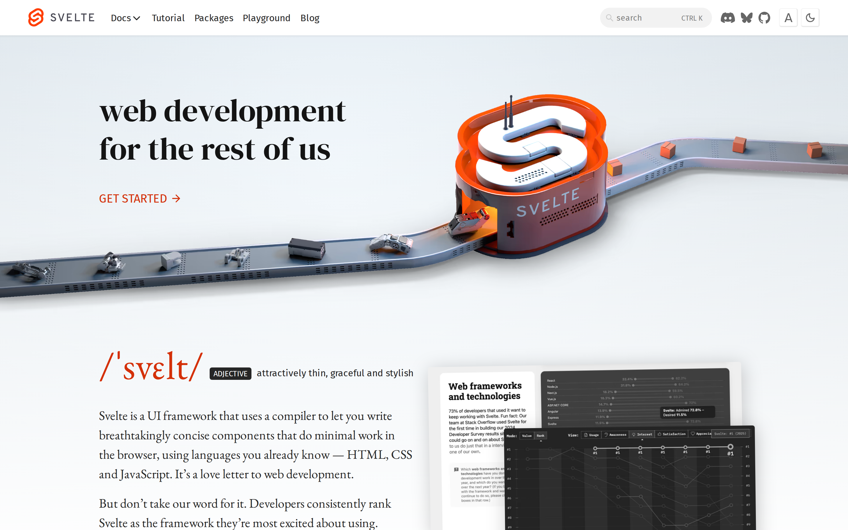
svelte.dev is built on a pure-white canvas (rgb(255, 255, 255)). The system uses rgb(212, 48, 8) as the high-saturation accent for primary actions. Crisp CTAs (4px radius) reinforce a precise, technical aesthetic alongside editorial serif type (DM Serif Display) — voice of authority. DM Serif Display is paired with Fira Sans for secondary roles. Depth comes from borders and surface contrast rather than shadows — a flat, structural elevation model. Interactions are smoothed by transitions across many elements, with little or no keyframe animation.
Color — roles, semantics & the full census
8 colors measured · click any swatch to copy
No semantic state colors detected — this system signals state through weight & motion, not hue.
8 colors mined from the live renderexpand
Type — the ladder, in the real face
5 roles · rendered live in the real Inter (captured woff2) · lines are editable, click any spec to copy
Spacing & radius, made spatial
9 spacing steps · 7 radii · bars are exact px widths
0px
4px
56px
64px
72px
80px
9999px
Motion — easings, transitions & live keyframes
0 easing curves · 2 keyframes · hover a tile to preview
Components — the closed vocabulary
10 component families · 25 variants counted on the live DOM
| Component | Variants found |
|---|---|
| links | ×10 |
| nav Links | ×4 |
| captions | ×3 |
| heading H2 | ×2 |
| buttons | ×1 |
| inputs | ×1 |
| cta Banner | ×1 |
| logo Tile | ×1 |
| heading H1 | ×1 |
| progress Bar | ×1 |
Component style specs (§4)expand
Buttons
Icon Button
- Background:
transparent - Text:
#262626{colors.ink-subtle} - Padding: 0px
- Radius: 4px
- Font: 10px weight 400
- Use: Toolbar/UI icons
- Hover: borderColor:
#ebebeb - Focus: outline:
rgb(212, 48, 8) solid 2px
Light / Invert
- Background:
#ffffff{colors.on-primary} - Text:
#262626{colors.ink-subtle} - Padding: 0px 10px
- Radius: 0px
- Font: 16px weight 400
- Use: Bright CTA on dark sections
- Hover: borderColor:
#ebebeb - Focus: outline:
rgb(212, 48, 8) solid 2px
Inputs & Forms
Text Input
- Background:
#f2f2f2{colors.surface-2} - Text:
#000000 - Padding: 7px 7px 5.6px 28px
- Radius: 56px
- Border: 0px none rgb(0, 0, 0)
- Font: 14px weight 400
- Use: Text fields, search inputs
- Focus: outline:
rgb(212, 48, 8) solid 2px
Navigation
Main Nav
- Background:
#ffffff{colors.on-primary} - Padding: 0px 48px
- Radius: none
- Font: 10px weight 400
- Use: Fixed/sticky grid nav — N/A items
- Hover: textDecoration:
underline
Layout — structure & dimensions
4 layout metrics measured
Responsive — real breakpoints
fluid system — no hard stops
No distinct @media breakpoints captured at the desktop/mobile pass — this layout is fluid, adapting by ratio rather than hard stops.
Do's & Don'ts
18 enforceable rules pulled verbatim from the spec
Agent guide & export
Paste-ready prompt + the real files behind this page