runwayml.com
Accent #5e6ad2 · abcNormal — chaque valeur ci-dessous est mesurée via getComputedStyle(), jamais affirmée à la main.
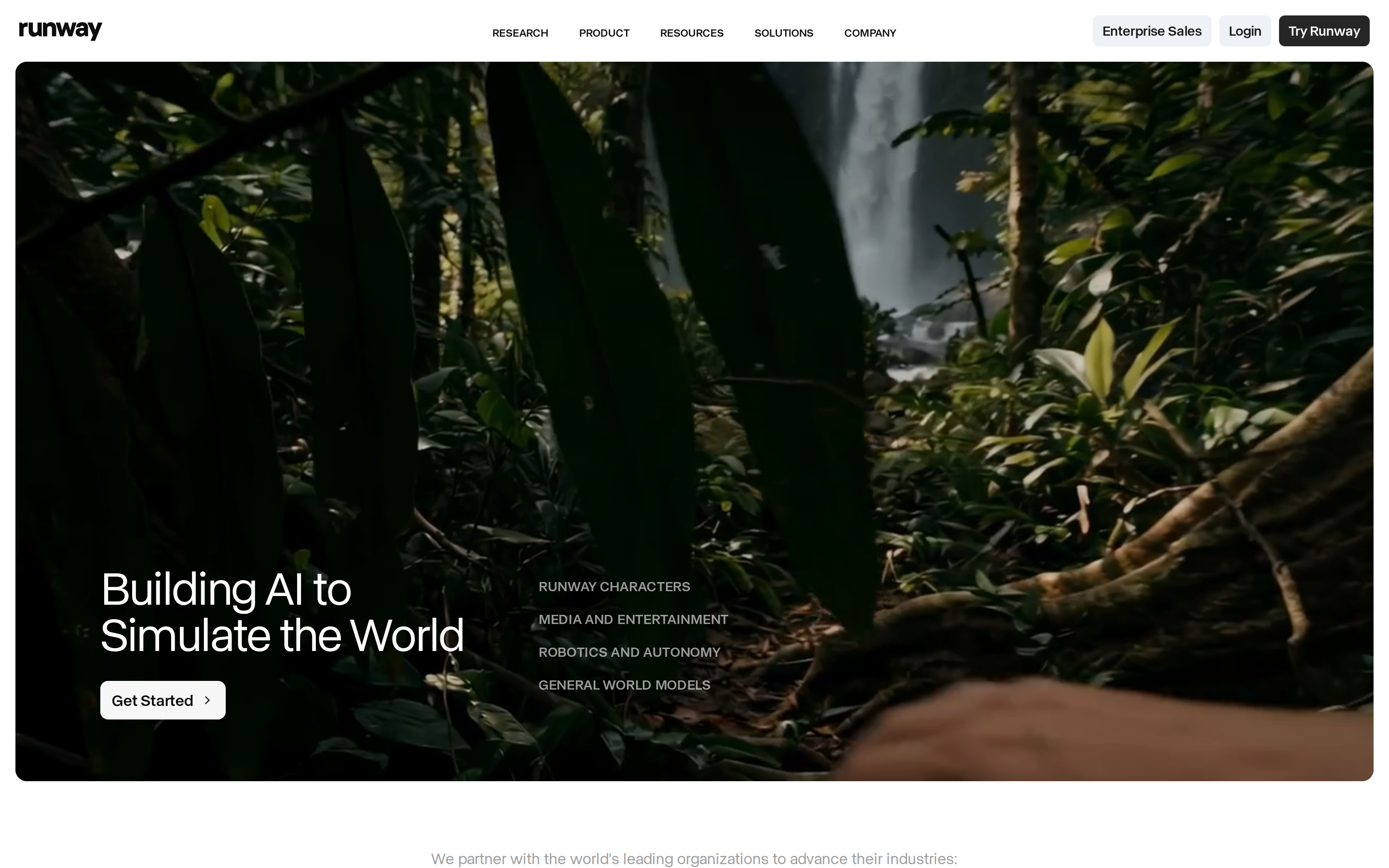

runwayml.com is built on a pure-white canvas (rgb(255,255,255)). The system uses rgb(247, 247, 247) as the singular interactive color. AbcNormal as the primary typeface. AbcNormal is paired with abcNormal Fallback for secondary roles. Depth comes from borders and surface contrast rather than shadows — a flat, structural elevation model. Interactions are smoothed by transitions across many elements, with little or no keyframe animation.
Color — roles, semantics & the full census
14 colors measured · click any swatch to copy
No semantic state colors detected — this system signals state through weight & motion, not hue.
14 colors mined from the live renderexpand
Type — the ladder, in the real face
6 roles · rendered live in the real Inter (captured woff2) · lines are editable, click any spec to copy
Spacing & radius, made spatial
9 spacing steps · 7 radii · bars are exact px widths
0px
4px
8px
12px
20px
32px
9999px
Motion — easings, transitions & live keyframes
1 easing curve · 3 keyframes · hover a tile to preview
Components — the closed vocabulary
10 component families · 39 variants counted on the live DOM
| Component | Variants found |
|---|---|
| buttons | ×10 |
| links | ×10 |
| nav Links | ×5 |
| heading H4 | ×3 |
| eyebrow Labels | ×3 |
| tabs | ×2 |
| footer Links | ×2 |
| heading H2 | ×2 |
| heading H1 | ×1 |
| heading H3 | ×1 |
Component style specs (§4)expand
Buttons
Ghost
- Background:
transparent - Text:
#ffffff{colors.background} - Padding: 4px 8px
- Radius: 4px
- Font: 14px weight 600
- Use: Subtle action, toolbar, nav button
Light / Invert
- Background:
#eef1f5{colors.surface-2} - Text:
#1a1a1a - Padding: 6px 10px
- Radius: 6px
- Font: 14px weight 600
- Use: Bright CTA on dark sections
Secondary
- Background:
#262626 - Text:
#ffffff{colors.background} - Padding: 6px 10px
- Radius: 6px
- Font: 14px weight 600
- Use: Secondary action
Light / Invert
- Background:
#f7f7f7{colors.primary-hover} - Text:
#0c0c0c{colors.ink-subtle} - Padding: 8px 12px
- Radius: 8px
- Font: 16px weight 600
- Use: Bright CTA on dark sections
Secondary
- Background:
#262626 - Text:
#ffffff{colors.background} - Padding: 4px 8px
- Radius: 4px
- Font: 14px weight 600
- Use: Secondary action
Light / Invert
- Background:
#ffffff{colors.background} - Text:
#1a1a1a - Padding: 4px 8px
- Radius: 4px
- Font: 14px weight 600
- Use: Bright CTA on dark sections
Subtle
- Background:
rgba(247, 247, 247, 0.05){colors.primary-hover} - Text:
#ffffff{colors.background} - Padding: 6px 10px
- Radius: 6px
- Font: 14px weight 600
- Use: Quiet action against page bg
Layout — structure & dimensions
4 layout metrics measured
Responsive — real breakpoints
7 media-query stops read from the live CSS
Do's & Don'ts
18 enforceable rules pulled verbatim from the spec
Agent guide & export
Paste-ready prompt + the real files behind this page