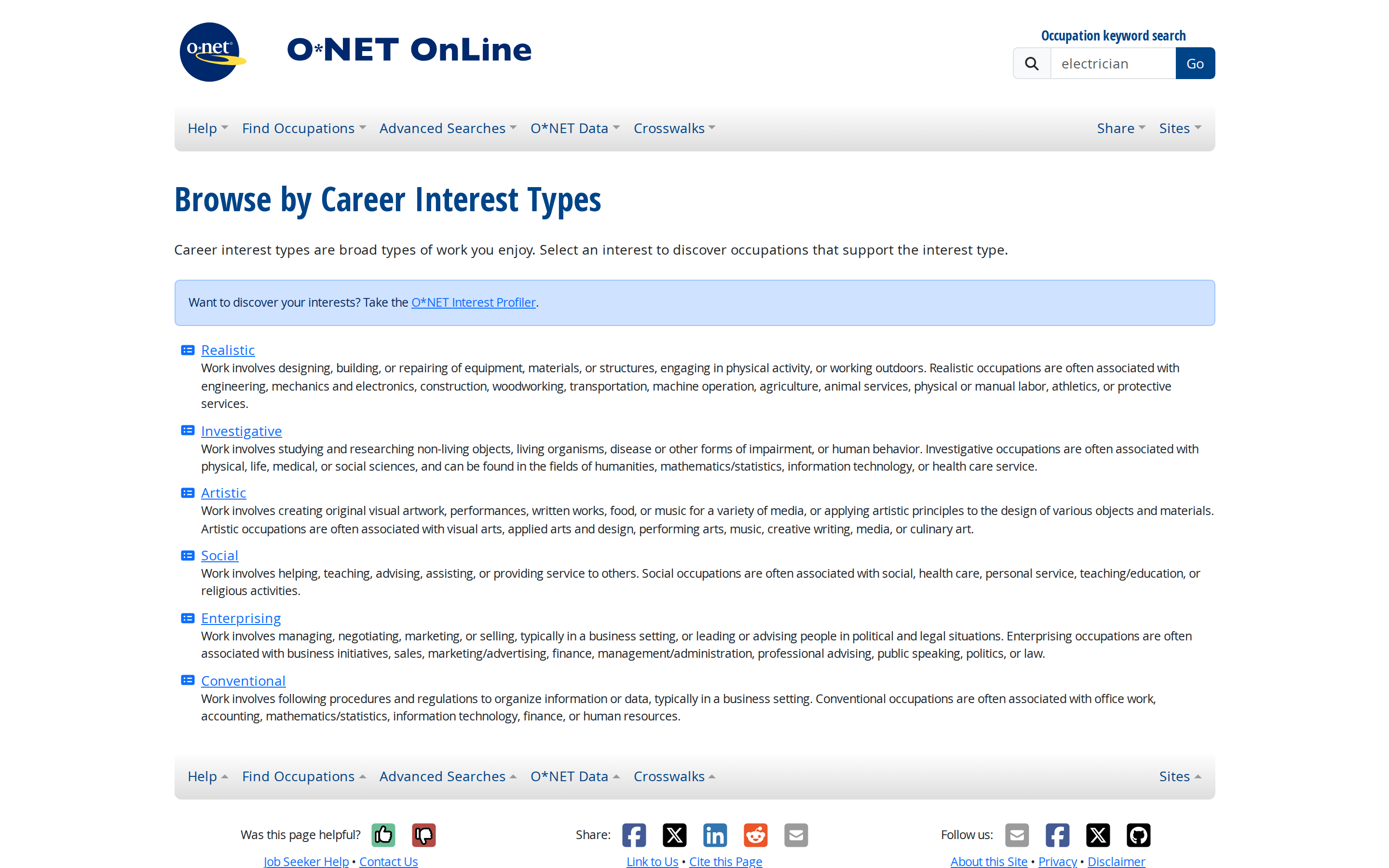
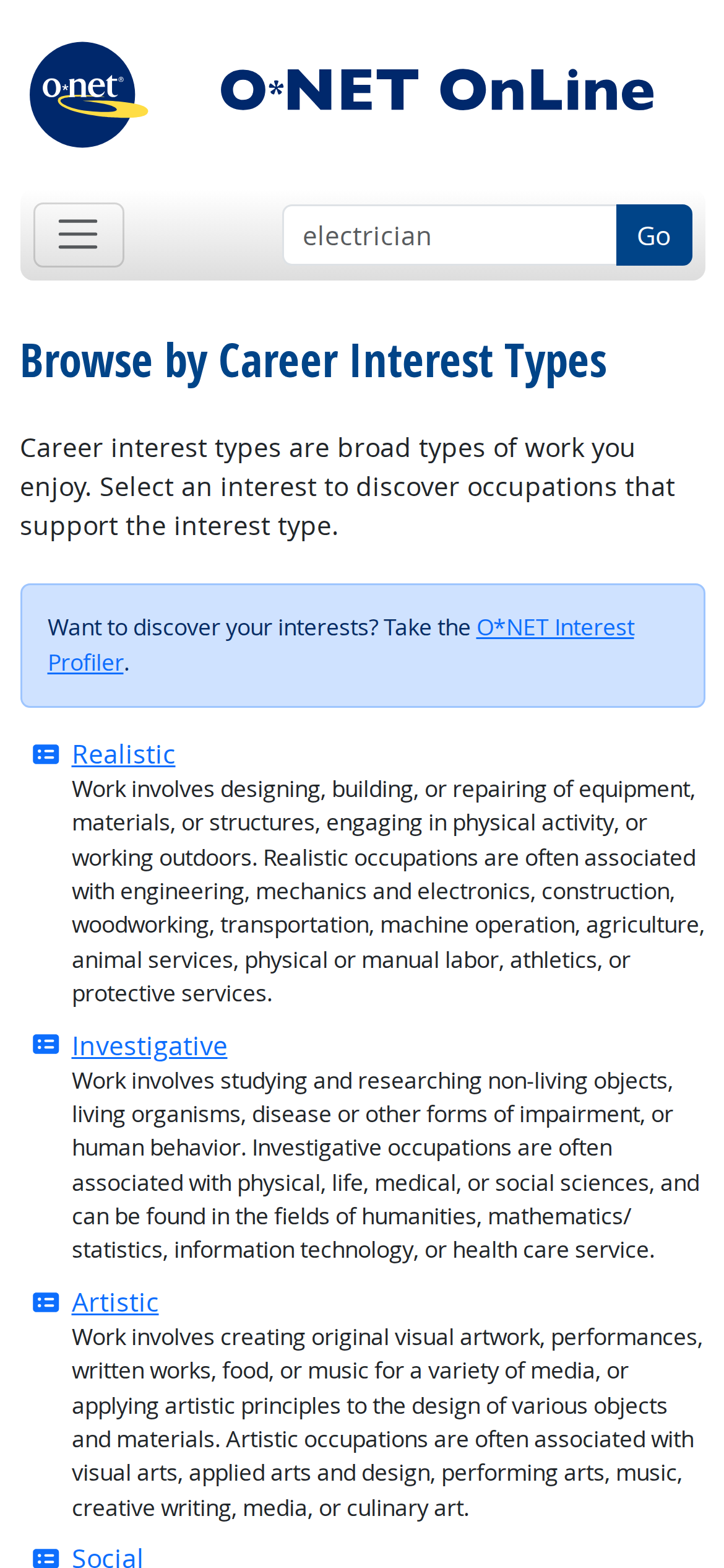
onetonline.org
Accent #5e6ad2 · OpenSans — chaque valeur ci-dessous est mesurée via getComputedStyle(), jamais affirmée à la main.
onetonline.org is built on a pure-white canvas (rgb(255, 255, 255)). The system uses rgb(0, 68, 136) as the accent for primary actions and brand signals. Sharp 0px corners on CTAs — architectural restraint, engineering precision alongside OpenSansCond as the primary typeface. Depth comes from borders and surface contrast rather than shadows — a flat, structural elevation model. Motion is a first-class concern — 12 keyframe animations plus transition-driven interactions.
Color — roles, semantics & the full census
18 colors measured · click any swatch to copy
4 semantic roles found.
18 colors mined from the live renderexpand
Type — the ladder, in the real face
3 roles · rendered live in the real Inter (captured woff2) · lines are editable, click any spec to copy
Spacing & radius, made spatial
9 spacing steps · 7 radii · bars are exact px widths
0px
5.25px
7px
14px
20px
32px
9999px
Motion — easings, transitions & live keyframes
1 easing curve · 12 keyframes · hover a tile to preview
Components — the closed vocabulary
7 component families · 9 variants counted on the live DOM
| Component | Variants found |
|---|---|
| buttons | ×2 |
| links | ×2 |
| inputs | ×1 |
| nav Links | ×1 |
| cta Banner | ×1 |
| heading H1 | ×1 |
| alert | ×1 |
Component style specs (§4)expand
Buttons
Ghost
- Background:
transparent - Text:
#212529{colors.ink} - Padding: 3.5px 14px
- Radius: 0px
- Font: 14px weight 400
- Use: Subtle action, toolbar, nav button
Primary Brand
- Background:
#004488{colors.primary} - Text:
#ffffff{colors.on-primary} - Padding: 5.25px 10.5px
- Radius: 0px 5.25px 5.25px 0px
- Border: 1px solid rgb(0, 68, 136)
- Font: 14px weight 400
- Use: Primary CTA / brand action
Inputs & Forms
Text Input
- Background:
#ffffff{colors.on-primary} - Text:
#212529{colors.ink} - Padding: 5.25px 10.5px
- Radius: 0px
- Border: 1px solid rgb(222, 226, 230)
- Font: 14px weight 400
- Use: Text fields, search inputs
- Focus: border:
1px solid rgb(220, 225, 231), borderColor:rgb(220, 225, 231), boxShadow:rgba(13, 110, 253, 0.008) 0px 0px 0px 0.0855841px
Navigation
Main Nav
- Background:
#f8f9fa{colors.surface-2} - Padding: 7px
- Radius: none
- Font: 14px weight 400
- Use: Fixed/sticky flex nav — N/A items
Alerts
Alert Banner
- Background:
#cfe2ff - Text:
#052c65 - Padding: 14px
- Radius: 5.25px
- Border: 1px solid rgb(158, 197, 254)
- Font: 12.25px weight 400
- Use: System alert, banner notification, toast
Layout — structure & dimensions
5 layout metrics measured
Responsive — real breakpoints
10 media-query stops read from the live CSS
Do's & Don'ts
15 enforceable rules pulled verbatim from the spec
Agent guide & export
Paste-ready prompt + the real files behind this page