superhuman.com
Accent #5e6ad2 · Super Sans VF — chaque valeur ci-dessous est mesurée via getComputedStyle(), jamais affirmée à la main.
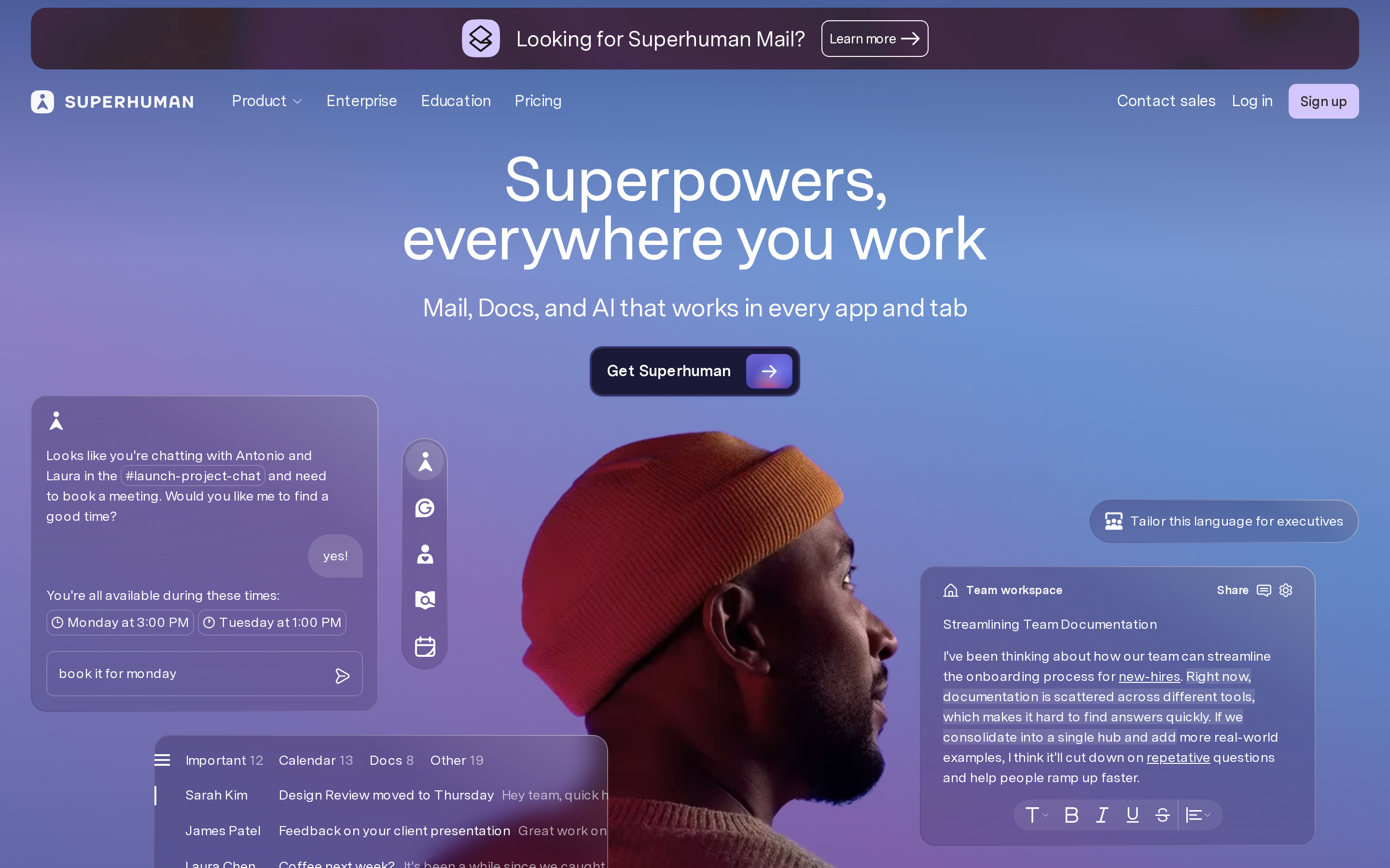
superhuman.com is built on a pure-white canvas (rgb(255, 255, 255)). The system uses rgb(212, 199, 255) as the singular interactive color. Sharp 0px corners on CTAs — architectural restraint, engineering precision alongside Super Sans VF as the primary typeface. A layered elevation system (6 distinct shadows) building a clear front-to-back hierarchy. Motion is minimal — a few targeted transitions, no decorative animation.
Color — roles, semantics & the full census
13 colors measured · click any swatch to copy
No semantic state colors detected — this system signals state through weight & motion, not hue.
13 colors mined from the live renderexpand
Type — the ladder, in the real face
5 roles · rendered live in the real Inter (captured woff2) · lines are editable, click any spec to copy
Spacing & radius, made spatial
9 spacing steps · 7 radii · bars are exact px widths
0px
8px
12px
16px
24px
999px
999px
Depth — elevation is extracted, not invented
6 box-shadows measured on the live page · click a tile to copy its raw value
Motion — easings, transitions & live keyframes
1 easing curve · 0 keyframes · hover a tile to preview
Transitions only — no @keyframes animation on this page. Motion lives entirely in the easing curves on the left.
Components — the closed vocabulary
9 component families · 46 variants counted on the live DOM
| Component | Variants found |
|---|---|
| buttons | ×10 |
| links | ×10 |
| nav Links | ×7 |
| cards | ×6 |
| heading H2 | ×6 |
| footer Links | ×2 |
| cta Banner | ×2 |
| heading H3 | ×2 |
| heading H1 | ×1 |
Component style specs (§4)expand
Buttons
Ghost
- Background:
transparent - Text:
#000000 - Padding: 0px 8px
- Radius: 0px
- Font: 16px weight 460
- Use: Subtle action, toolbar, nav button
- Hover: color:
#ffffff, border:0px none rgb(255, 255, 255), borderColor:#ffffff - Focus: outline:
rgb(59, 150, 255) solid 2px
Secondary
- Background:
#d4c7ff{colors.primary} - Text:
#292827{colors.hairline} - Padding: 6px 12px
- Radius: 8px
- Font: 14px weight 600
- Use: Secondary action
- Hover: color:
#ffffff, border:0px none rgb(255, 255, 255), borderColor:#ffffff - Focus: outline:
rgb(59, 150, 255) solid 2px
Outline
- Background:
transparent - Text:
#ffffff{colors.background} - Padding: 6px 6px 6px 16px
- Radius: 12px
- Border: 1px solid color(srgb 1 1 1 / 0.12)
- Shadow:
color(srgb 0.0784314 0.0784314 0.0745098 / 0.24) 0px 1px 2px 0px, rgb(53, 48, 13... - Font: 16px weight 460
- Use: Secondary action with border
- Hover: color:
#ffffff, border:0px none rgb(255, 255, 255), borderColor:#ffffff - Focus: outline:
rgb(59, 150, 255) solid 2px
Secondary
- Background:
#421d24 - Text:
#ffffff{colors.background} - Padding: 12px
- Radius: 16px
- Font: 14px weight 460
- Use: Secondary action
- Hover: color:
#ffffff, border:0px none rgb(255, 255, 255), borderColor:#ffffff - Focus: outline:
rgb(59, 150, 255) solid 2px
Cards & Containers
Standard Card
- Background:
transparent - Padding: 16px
- Radius: 16px
- Use: Content containers, listing items
Layout — structure & dimensions
4 layout metrics measured
Responsive — real breakpoints
fluid system — no hard stops
No distinct @media breakpoints captured at the desktop/mobile pass — this layout is fluid, adapting by ratio rather than hard stops.
Do's & Don'ts
20 enforceable rules pulled verbatim from the spec
Agent guide & export
Paste-ready prompt + the real files behind this page