spotify.com
Accent #5e6ad2 · SpotifyMixUI — chaque valeur ci-dessous est mesurée via getComputedStyle(), jamais affirmée à la main.
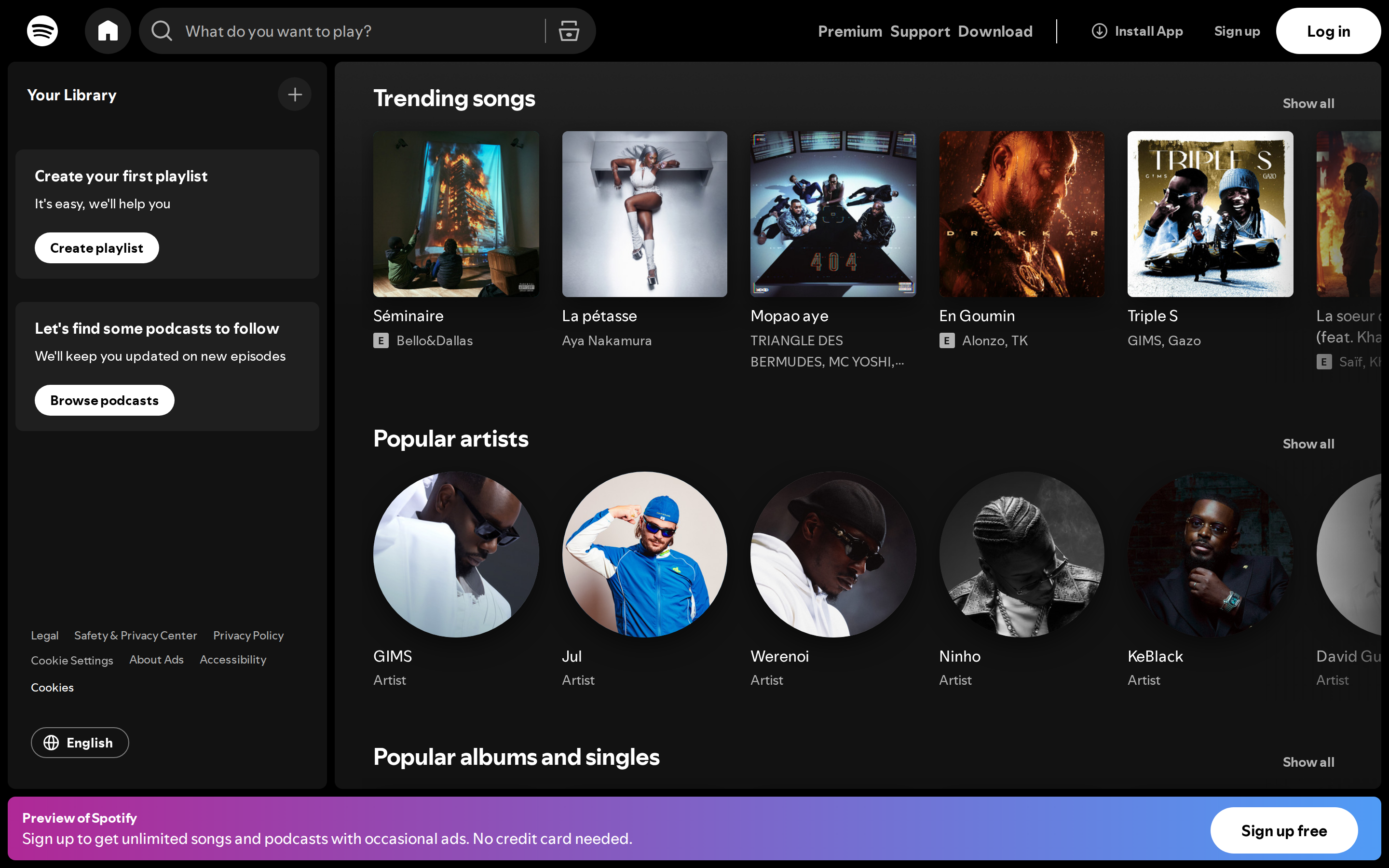
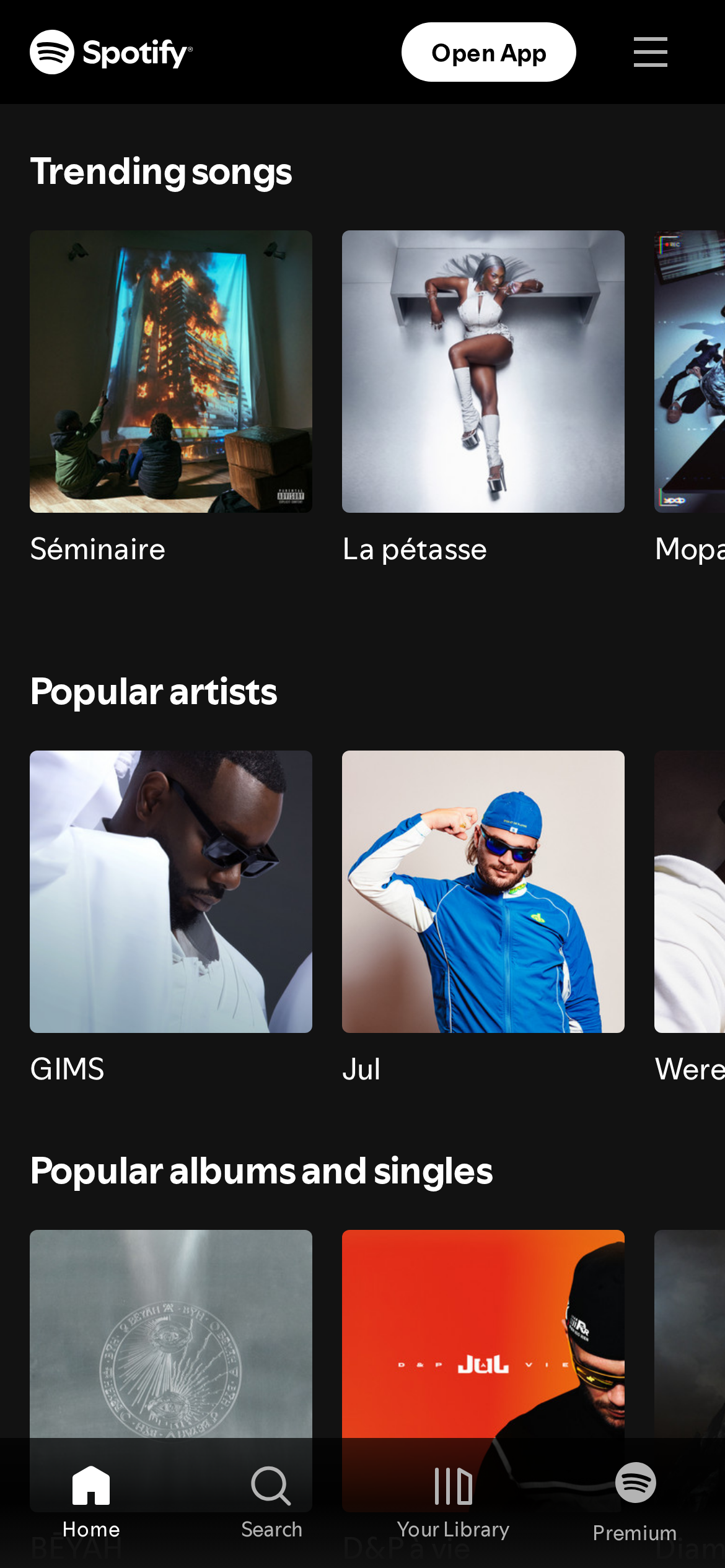
spotify.com is built on a pure-white canvas (rgb(255,255,255)). The system uses rgb(31, 31, 31) as the singular interactive color. Generously rounded CTAs (50%) suggest approachable, content-first design alongside SpotifyMixUITitle as the primary typeface. SpotifyMixUITitle is paired with CircularSp-Arab for secondary roles. A layered elevation system (6 distinct shadows) building a clear front-to-back hierarchy. Interactions are smoothed by transitions across many elements, with little or no keyframe animation.
Color — roles, semantics & the full census
58 colors measured · click any swatch to copy
2 semantic roles found.
58 colors mined from the live renderexpand
Type — the ladder, in the real face
4 roles · rendered live in the real Inter (captured woff2) · lines are editable, click any spec to copy
Spacing & radius, made spatial
9 spacing steps · 7 radii · bars are exact px widths
0px
4px
8px
32px
500px
9999px
9999px
Depth — elevation is extracted, not invented
6 box-shadows measured on the live page · click a tile to copy its raw value
Motion — easings, transitions & live keyframes
3 easing curves · 1 keyframes · hover a tile to preview
Components — the closed vocabulary
9 component families · 50 variants counted on the live DOM
| Component | Variants found |
|---|---|
| buttons | ×10 |
| cards | ×10 |
| nav Links | ×10 |
| links | ×10 |
| data Table | ×4 |
| inputs | ×3 |
| search Bar | ×1 |
| heading H1 | ×1 |
| heading H2 | ×1 |
Component style specs (§4)expand
Buttons
Secondary
- Background:
#1f1f1f{colors.primary} - Text:
#ffffff{colors.on-primary} - Padding: 12px
- Radius: 50%
- Font: 16px weight 400
- Use: Secondary action
- Hover: transform:
matrix(1.04, 0, 0, 1.04, 0, 0)
Pill
- Background:
transparent - Text:
#b3b3b3{colors.hairline} - Padding: 12px
- Radius: 9999px
- Font: 16px weight 400
- Use: Status pills, tags, chips
- Hover: transform:
matrix(1.04, 0, 0, 1.04, 0, 0)
Icon Button
- Background:
transparent - Text:
#b3b3b3{colors.hairline} - Padding: 0px
- Radius: 9999px
- Font: 16px weight 400
- Use: Toolbar/UI icons
- Hover: transform:
matrix(1.04, 0, 0, 1.04, 0, 0)
Pill
- Background:
transparent - Text:
#b3b3b3{colors.hairline} - Padding: 8px 0px
- Radius: 9999px
- Font: 16px weight 700
- Use: Status pills, tags, chips
- Hover: transform:
matrix(1.04, 0, 0, 1.04, 0, 0)
Icon Button
- Background:
#1f1f1f{colors.primary} - Text:
#b3b3b3{colors.hairline} - Padding: 8px
- Radius: 9999px
- Font: 13.3333px weight 400
- Use: Toolbar/UI icons
- Hover: transform:
matrix(1.04, 0, 0, 1.04, 0, 0)
Cards & Containers
Standard Card
- Background:
transparent - Padding: 12px
- Radius: 6px
- Use: Content containers, listing items
Inputs & Forms
Text Input
- Background:
#ffffff{colors.on-primary} - Text:
#000000
Layout — structure & dimensions
4 layout metrics measured
Responsive — real breakpoints
17 media-query stops read from the live CSS
Do's & Don'ts
19 enforceable rules pulled verbatim from the spec
Agent guide & export
Paste-ready prompt + the real files behind this page