Prism prismd.fr
Extracted · 10 sections · 36 colors · grade C

sentry.io

Accent #79628c · Rubik — chaque valeur ci-dessous est mesurée via getComputedStyle(), jamais affirmée à la main.

36
colors
6
faces
6
shadows
10
keyframes
sentry.io
rendu réel · source de vérité

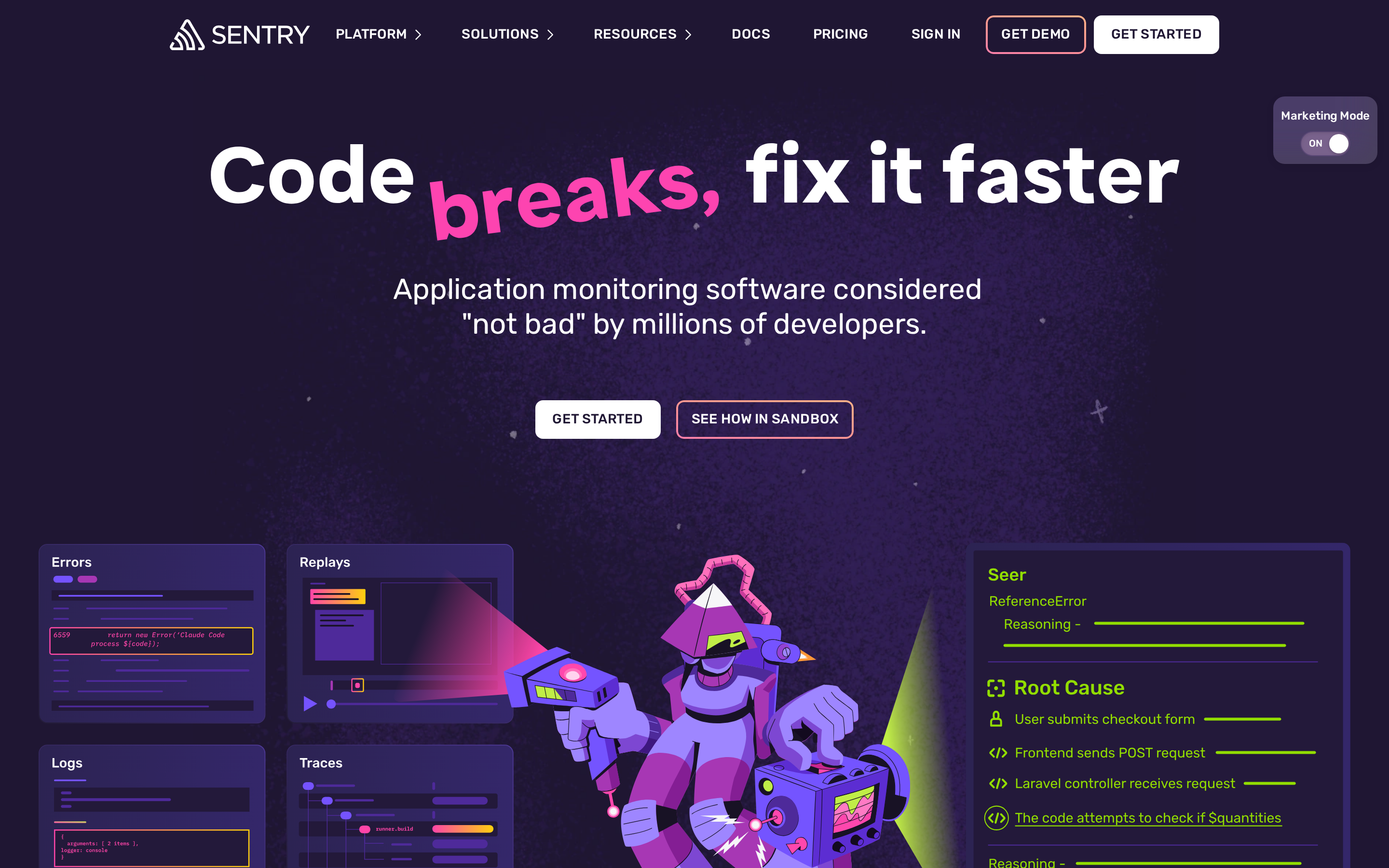
sentry.io is built on a near-black canvas (rgb(31, 22, 51)). The system uses rgb(121, 98, 140) as the singular interactive color. Moderately rounded CTAs (8px) — modern SaaS standard, neither sharp nor pill alongside Dammit Sans as the primary typeface. A layered elevation system (6 distinct shadows) building a clear front-to-back hierarchy. Motion is a first-class concern — 10 keyframe animations plus transition-driven interactions.

01

Color — roles, semantics & the full census

36 colors measured · click any swatch to copy

Canvas
#1f1633
AAA 17.2:1
Ink
#ffffff
AAA 17.2:1
Accent
#79628c
AA·lg 3.23:1
Line
#ffffff
AAA 17.2:1
Semantic states

No semantic state colors detected — this system signals state through weight & motion, not hue.

36 colors mined from the live renderexpand
02

Type — the ladder, in the real face

7 roles · rendered live in the real Rubik (captured woff2) · lines are editable, click any spec to copy

display xl
display-xl88px · 700
display md
display-md24px · 500 · ×3.67
body
body16px · 400 · ×1.50
caption
caption16px · 400 · ×1.00
button
button14px · 500 · ×1.14
eyebrow
eyebrow27px · 500 · ×0.52
mono
mono16px · 500 · ×1.69
03

Spacing & radius, made spatial

9 spacing steps · 7 radii · bars are exact px widths

Spacing scale
xxs · 2px
xs · 4px
sm · 8px
md · 12px
base · 16px
lg · 24px
xl · 32px
2xl · 44px
3xl · 64px
Radius
none
0px
xs
4px
sm
8px
md
13px
lg
18px
xl
9999px
full
9999px
04

Depth — elevation is extracted, not invented

6 box-shadows measured on the live page · click a tile to copy its raw value

shadow-1
shadow-2
shadow-3
shadow-4
shadow-5
05

Motion — easings, transitions & live keyframes

1 easing curve · 10 keyframes · hover a tile to preview

Easing & transitions
transition-2cubic-bezier(0.4, 0, 0.2, 1)
10 keyframe animations extracted
fadeIn
float
logo-rock
scroll-x
expandSnippet
shrinkSnippet
swingDown
pushUp
_spin_1vwuf_1
_thumbRotation_1vwuf_1
06

Components — the closed vocabulary

13 component families · 44 variants counted on the live DOM

ComponentVariants found
code Block×10
buttons×9
badges×5
footer Links×5
inputs×3
heading H2×2
heading H3×2
eyebrow Labels×2
accordion×2
nav Links×1
logo Tile×1
heading H1×1
links×1
Component style specs (§4)expand

Buttons

Light / Invert

  • Background: #efefef
  • Text: #1a1a1a
  • Padding: 12px 16px
  • Radius: 8px
  • Border: 2px solid rgba(0, 0, 0, 0)
  • Font: 14px weight 500
  • Use: Bright CTA on dark sections

Ghost

  • Background: transparent
  • Text: #ffffff {colors.hairline}
  • Padding: 12px 16px
  • Radius: 8px
  • Border: 2px solid rgba(0, 0, 0, 0)
  • Font: 14px weight 500
  • Use: Subtle action, toolbar, nav button

Ghost

  • Background: transparent
  • Text: #ffffff {colors.hairline}
  • Padding: 12px 16px
  • Radius: 8px
  • Font: 14px weight 700
  • Use: Subtle action, toolbar, nav button

Pill

  • Background: #79628c {colors.primary}
  • Text: #ffffff {colors.hairline}
  • Padding: 0px
  • Radius: 13px
  • Border: 1px solid rgb(88, 70, 116)
  • Shadow: rgba(0, 0, 0, 0.1) 0px 1px 3px 0px inset
  • Font: 12px weight 400
  • Use: Status pills, tags, chips

Icon Button

  • Background: #150f23 {colors.surface-2}
  • Text: #ffffff {colors.hairline}
  • Padding: 0px
  • Radius: 0px
  • Shadow: rgb(21, 15, 35) 0px 0px 8px 6px
  • Font: 16px weight 400
  • Use: Toolbar/UI icons

Inputs & Forms

Text Input

  • Background: #ffffff {colors.hairline}
  • Text: #1f1633 {colors.surface-1}
  • Padding: 8px 12px
  • Radius: 6px
  • Border: 1px solid rgb(207, 207, 219)
  • Shadow: rgba(0, 0, 0, 0.15) 0px 2px 10px 0px inset
  • Font: 16px weight 400
  • Use: Text fields, search inputs
07

Layout — structure & dimensions

4 layout metrics measured

header 72px 1200px max-width
max Width1200px
header Height72px
sidebar Width0px
container Padding0px
08

Responsive — real breakpoints

10 media-query stops read from the live CSS

576px
640px
767px
768px
991px
992px
1024px
1151px
1152px
1440px
09

Do's & Don'ts

22 enforceable rules pulled verbatim from the spec

Do
Use dark background (`#1f1633`) as the foundation — this is a dark-mode-native design
Use Rubik as the primary typeface — it defines the brand personality
Use the extracted shadow patterns for elevation — they are tuned to match the brand palette
Use full-pill radius (9999px) only for specific elements (avatars, pills, toggles)
Use Slate Gray (`#79628c`) as the primary accent — it's the brand's signature interactive color
Use 8px border-radius on buttons — the standard corner rounding for interactive elements
Style form inputs with a `1px solid rgb(207, 207, 219)` border — use border-based inputs, not floating labels or underline-only
Maintain nav height at 72px — consistent vertical space for the navigation bar
Respect the 4px–32px spacing range — the design uses a wide scale for visual breathing room
Include a theme toggle in the nav — dark mode is a first-class feature
Each card includes a top image — imagery is part of the card identity, not optional
Use a 3-column grid on desktop — density matters for this content type
Lay out testimonials in a grid (5+ items) — quantity signals scale and trust
Build a content-dense footer (4 columns, ~38 links) — this site treats the footer as a sitemap, not an afterthought
Don't
Don't use light backgrounds — the dark canvas is the native medium
Don't substitute with generic sans-serif or serif — the custom font carries the brand
Don't invent new shadow values — use only the extracted shadow levels
Don't apply pill radius on rectangular buttons or cards — it's reserved for specific interactive elements
Don't introduce additional saturated accent colors — the palette is intentionally controlled
Don't remove the input border — the border is the primary affordance indicator for form fields
Don't collapse or hide the nav on scroll without an explicit scroll-triggered animation — the design uses fixed nav presence
Don't make the nav sticky — this design lets it scroll away to maximize content focus
10

Agent guide & export

Paste-ready prompt + the real files behind this page

Build a UI in the sentry.io design system. Canvas #1f1633 · ink #ffffff · accent #79628c. Type: Rubik — respect the size/weight ladder in §3. Radius, spacing, shadow: use only the extracted scales (no magic numbers). Full spec follows — paste the DESIGN.md below into your agent.
Every value above was getComputedStyle-verified.
$ npx prismd add sentry
DESIGN.md · narrative spec tokens.json