Prism prismd.fr
Extracted · 10 sections · 249 colors · grade B

posthog.com

Accent #cd8407 · IBM Plex Sans Variable — chaque valeur ci-dessous est mesurée via getComputedStyle(), jamais affirmée à la main.

249
colors
4
faces
2
shadows
43
keyframes
posthog.com
rendu réel · source de vérité

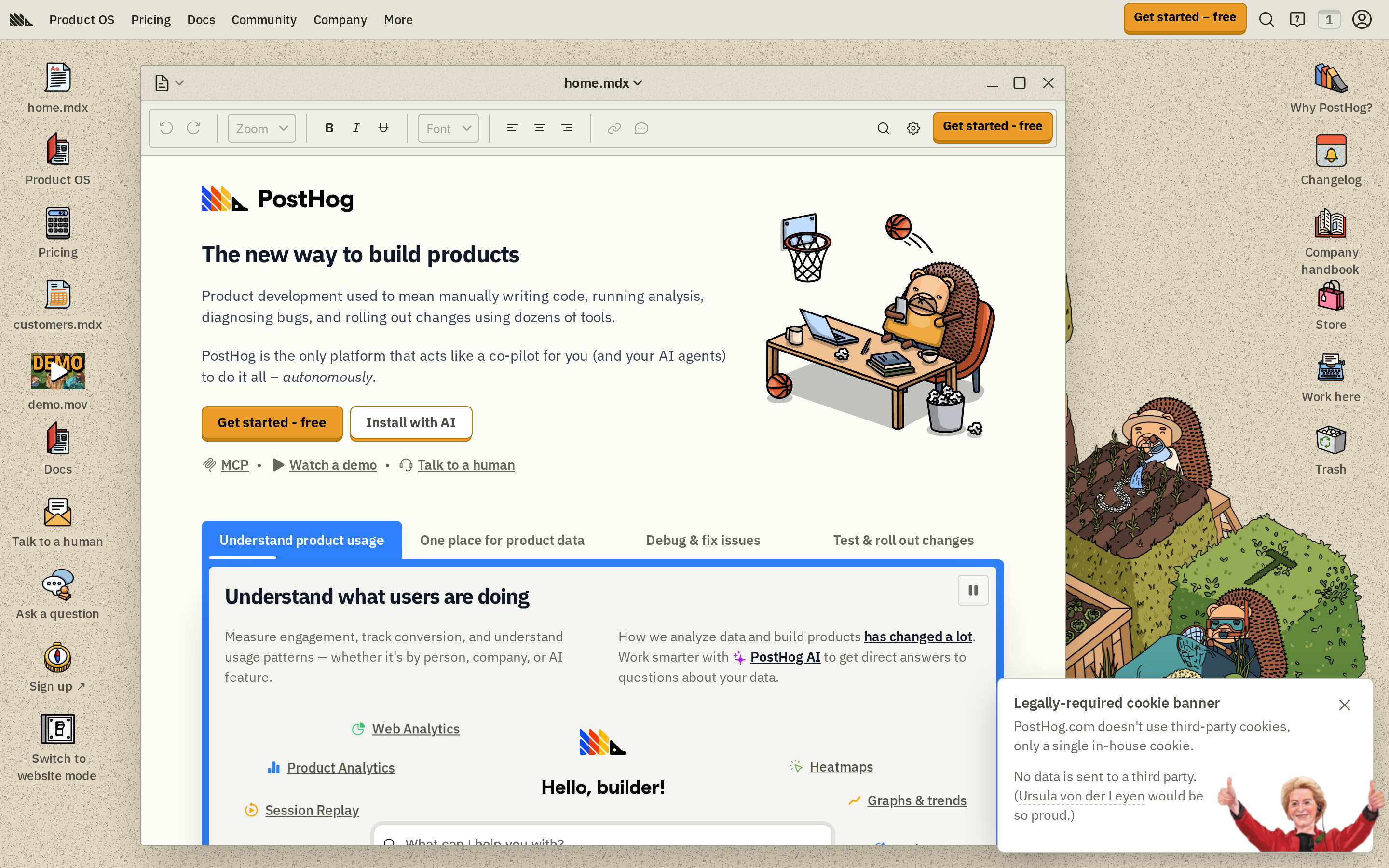
posthog.com is built on a warm, off-white canvas (rgb(238, 239, 233)). The system uses rgb(205, 132, 7) as the high-saturation accent for primary actions. Crisp CTAs (4px radius) reinforce a precise, technical aesthetic alongside IBM Plex Sans Variable as the primary typeface. IBM Plex Sans Variable is paired with IBM Plex Sans for secondary roles. A restrained elevation system (2 distinct shadows) — shadows reserved for the few elements that must lift off the page. Motion is a first-class concern — 43 keyframe animations plus transition-driven interactions.

01

Color — roles, semantics & the full census

249 colors measured · click any swatch to copy

Canvas
#eeefe9
AAA 16.33:1
Ink
#111111
AAA 16.33:1
Accent
#cd8407
Fail 2.63:1
Line
#bfc1b7
Fail 1.58:1
Semantic states

No semantic state colors detected — this system signals state through weight & motion, not hue.

249 colors mined from the live renderexpand
02

Type — the ladder, in the real face

5 roles · rendered live in the real IBM Plex Sans Variable (captured woff2) · lines are editable, click any spec to copy

display xl
display-xl24px · 800
display md
display-md19.2857px · 600 · ×1.24
body
body16px · 400 · ×1.21
body sm
body-sm15px · 600 · ×1.07
button
button13px · 500 · ×1.15
03

Spacing & radius, made spatial

9 spacing steps · 7 radii · bars are exact px widths

Spacing scale
xxs · 2px
xs · 4px
sm · 8px
md · 16px
base · 32px
lg · 40px
xl · 48px
2xl · 56px
3xl · 64px
Radius
none
0px
xs
4px
sm
8px
md
9999px
lg
10007px
xl
10015px
full
9999px
04

Depth — elevation is extracted, not invented

2 box-shadows measured on the live page · click a tile to copy its raw value

shadow-1
shadow-2
05

Motion — easings, transitions & live keyframes

1 easing curve · 43 keyframes · hover a tile to preview

Easing & transitions
transition-2cubic-bezier(0.4, 0, 0.2, 1)
43 keyframe animations extracted
slideRight
rcSliderTooltipZoomDownIn
rcSliderTooltipZoomDownOut
wobble
breathe
develop
flash
float
gradient-rotate
grow
grow-sm
hogfather-jump
06

Components — the closed vocabulary

11 component families · 33 variants counted on the live DOM

ComponentVariants found
buttons×10
links×8
nav Links×3
tabs×3
heading H1×2
captions×2
cards×1
heading H2×1
heading H3×1
code Block×1
alert×1
Component style specs (§4)expand

Buttons

Ghost

  • Background: transparent
  • Text: #23251d {colors.ink-subtle}
  • Padding: 2px 8px
  • Radius: 4px
  • Font: 13px weight 500
  • Use: Subtle action, toolbar, nav button
  • Focus: backgroundColor: rgb(200, 202, 193)

Primary Brand

  • Background: #cd8407 {colors.primary}
  • Text: #23251d {colors.ink-subtle}
  • Padding: 0px
  • Radius: 6px
  • Border: 1px solid rgb(177, 120, 22)
  • Font: 16px weight 400
  • Use: Primary CTA / brand action
  • Focus: backgroundColor: rgb(200, 202, 193)

Ghost

  • Background: transparent
  • Text: #23251d {colors.ink-subtle}
  • Padding: 2px 4px
  • Radius: 4px
  • Border: 1px solid rgba(0, 0, 0, 0)
  • Font: 13px weight 400
  • Use: Subtle action, toolbar, nav button
  • Focus: backgroundColor: rgb(200, 202, 193)

Light / Invert

  • Background: #e5e7e0 {colors.surface-1}
  • Text: #65675e
  • Padding: 4px 6px
  • Radius: 4px
  • Font: 16px weight 400
  • Use: Bright CTA on dark sections
  • Focus: backgroundColor: rgb(200, 202, 193)

Subtle

  • Background: rgba(210, 211, 204, 0.5)
  • Text: #23251d {colors.ink-subtle}
  • Padding: 12px 8px 4px 20px
  • Radius: 0px 0px 6px 6px
  • Font: 12px weight 400
  • Use: Quiet action against page bg
  • Focus: backgroundColor: rgb(200, 202, 193)

Cards & Containers

Standard Card

  • Background: transparent
  • Padding: 16px 32px
  • Radius: 0px
  • Use: Content containers, listing items

Tabs

Pill Tab

07

Layout — structure & dimensions

4 layout metrics measured

header 64px 1200px max-width
max Width1200px
header Height64px
sidebar Width267px
container Padding0px
08

Responsive — real breakpoints

12 media-query stops read from the live CSS

425px
482px
640px
767px
768px
800px
900px
1024px
1076px
1160px
1280px
1536px
09

Do's & Don'ts

21 enforceable rules pulled verbatim from the spec

Do
Use Whitesmoke (`#eeefe9`) as the page background — it's intentionally not pure white
Use IBM Plex Sans Variable as the primary typeface — it defines the brand personality
Use negative letter-spacing (-0.6px) at display sizes for compressed, editorial headlines
Use the extracted shadow patterns for elevation — they are tuned to match the brand palette
Use full-pill radius (9999px) only for specific elements (avatars, pills, toggles)
Use #cd8407 (`#cd8407`) as the primary accent — it's the brand's signature interactive color
Use 6px border-radius on buttons — the standard corner rounding for interactive elements
Apply 16px 32px padding inside cards — matches the design system's content breathing room
Respect the 4px–48px spacing range — the design uses a wide scale for visual breathing room
Make the hero full-viewport (≥70% screen height) — this design uses an immersive hero, not a tall navbar
Build the hero as a split layout with media on the left — text and visual share equal weight
Include exactly 13 CTAs in the hero (primary + secondary) — this design pattern is multi-action, not single-purpose
Each card uses an icon (not photo) — the visual language is illustrative, not photographic
Use a 4-column grid on desktop — density matters for this content type
Don't
Don't use pure white (`#ffffff`) as a page background — the warm tone is part of the brand identity
Don't substitute with generic sans-serif or serif — the custom font carries the brand
Don't increase letter-spacing on headings — the type is designed to run tight at scale
Don't invent new shadow values — use only the extracted shadow levels
Don't apply pill radius on rectangular buttons or cards — it's reserved for specific interactive elements
Don't introduce additional saturated accent colors — the palette is intentionally controlled
Don't over-build the footer — this design keeps it minimal (1 cols, 0 links)
10

Agent guide & export

Paste-ready prompt + the real files behind this page

Build a UI in the posthog.com design system. Canvas #eeefe9 · ink #111111 · accent #cd8407. Type: IBM Plex Sans Variable — respect the size/weight ladder in §3. Radius, spacing, shadow: use only the extracted scales (no magic numbers). Full spec follows — paste the DESIGN.md below into your agent.
Every value above was getComputedStyle-verified.
$ npx prismd add posthog
DESIGN.md · narrative spec tokens.json