Prism prismd.fr
Extracted · 10 sections · 63 colors · grade B

attio.com

Accent #266df0 · inter — chaque valeur ci-dessous est mesurée via getComputedStyle(), jamais affirmée à la main.

63
colors
11
faces
6
shadows
50
keyframes
attio.com
rendu réel · source de vérité

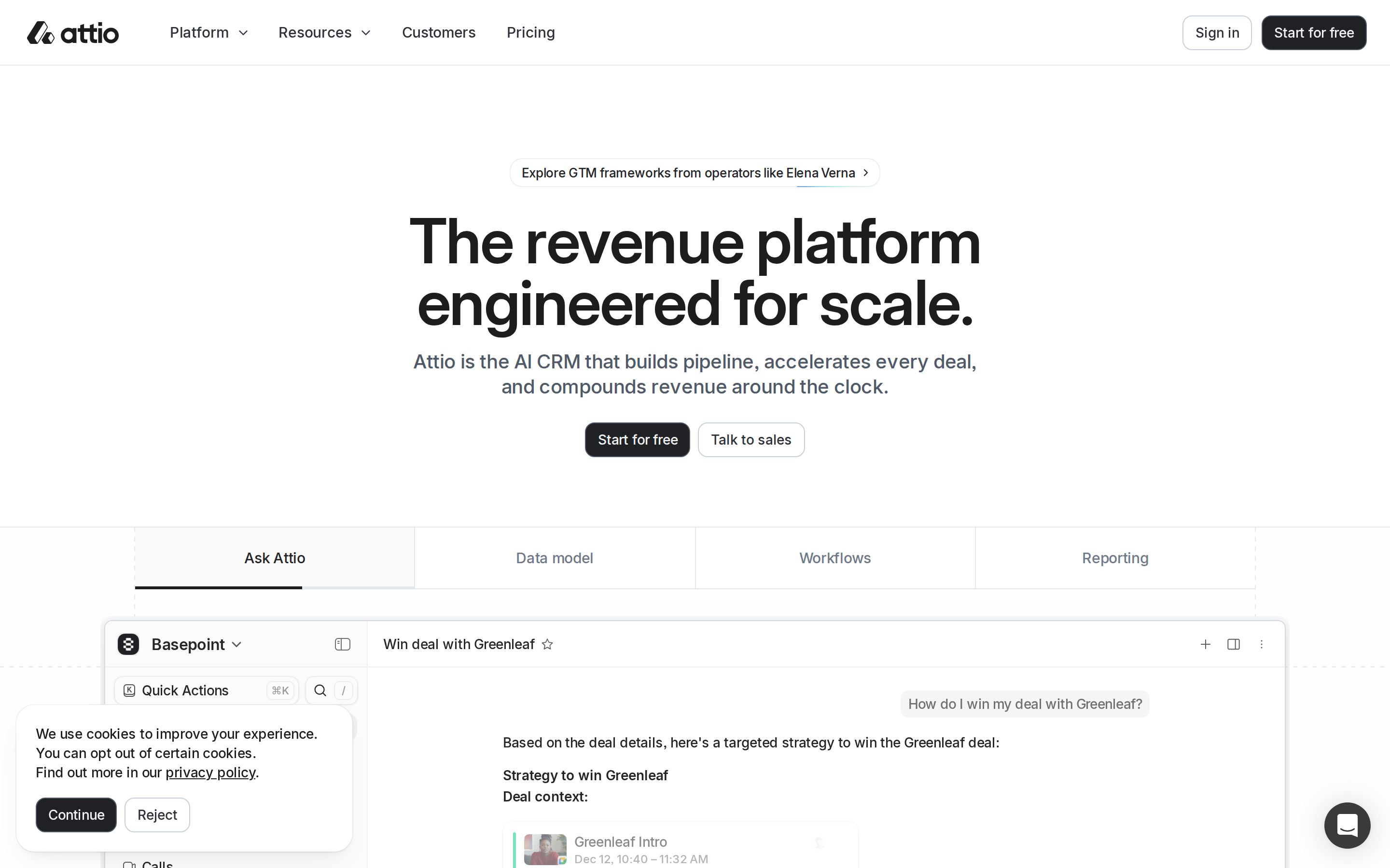
attio.com is built on a mid-dark canvas (lab(99.9987 0.0337958 0.000309944)). The system uses rgb(32, 33, 36) as a near-neutral accent (low saturation). Moderately rounded CTAs (12px) — modern SaaS standard, neither sharp nor pill alongside interDisplay as the primary typeface. InterDisplay is paired with inter Fallback for secondary roles. A layered elevation system (6 distinct shadows) building a clear front-to-back hierarchy. Motion is a first-class concern — 50 keyframe animations plus transition-driven interactions.

01

Color — roles, semantics & the full census

63 colors measured · click any swatch to copy

Canvas
#ffffff
AAA 18.88:1
Ink
#111111
AAA 18.88:1
Accent
#202124
AAA 16.1:1
Line
#cad0d9
Fail 1.55:1
Semantic states

No semantic state colors detected — this system signals state through weight & motion, not hue.

63 colors mined from the live renderexpand
02

Type — the ladder, in the real face

5 roles · rendered live in the real inter (captured woff2) · lines are editable, click any spec to copy

display xl
display-xl64px · 600
display md
display-md32px · 600 · ×2.00
body
body12px · 600 · ×2.67
button
button15px · 500 · ×0.80
eyebrow
eyebrow12px · 600 · ×1.25
03

Spacing & radius, made spatial

9 spacing steps · 7 radii · bars are exact px widths

Spacing scale
xxs · 2px
xs · 6px
sm · 10px
md · 13px
base · 16px
lg · 24px
xl · 30px
2xl · 40px
3xl · 64px
Radius
none
0px
xs
4px
sm
8px
md
13px
lg
16px
xl
32px
full
9999px
04

Depth — elevation is extracted, not invented

6 box-shadows measured on the live page · click a tile to copy its raw value

shadow-1
shadow-2
shadow-3
shadow-4
shadow-5
05

Motion — easings, transitions & live keyframes

13 easing curves · 50 keyframes · hover a tile to preview

Easing & transitions
transition-2cubic-bezier(0.4, 0, 0.2, 1)
transition-3cubic-bezier(0.65, 0, 0.35, 1)
transition-4cubic-bezier(0.2, 0, 0, 1)
ease-incubic-bezier(.3, 0, 1, 1)
ease-in-out-cubiccubic-bezier(.65, 0, .35, 1)
default-transition-timing-functioncubic-bezier(.4, 0, .2, 1)
ease-in-out-expocubic-bezier(1, 0, 0, 1)
ease-outcubic-bezier(0, 0, 0, 1)
50 keyframe animations extracted
ai-hero-box-gradient-spin
rotate-reporting
pricing-cards-grid-line-appear
rotate
connection
running
completed
spin
pulse
enter
exit
navigation-enter-from-right
06

Components — the closed vocabulary

12 component families · 45 variants counted on the live DOM

ComponentVariants found
buttons×10
links×9
heading H2×5
captions×5
nav Links×4
footer Links×4
heading H3×3
cards×1
badges×1
heading H1×1
eyebrow Labels×1
data Table×1
Component style specs (§4)expand

Buttons

Ghost

  • Background: transparent
  • Text: #eceff3
  • Padding: 0px
  • Radius: 10px
  • Border: 1px solid rgba(0, 0, 0, 0)
  • Font: 16px weight 500
  • Use: Subtle action, toolbar, nav button

Ghost

  • Background: transparent
  • Text: #1c1d1f {colors.ink-muted}
  • Padding: 8px 4px
  • Radius: 12px
  • Font: 16px weight 500
  • Use: Subtle action, toolbar, nav button

Light / Invert

  • Background: #ffffff {colors.on-primary}
  • Text: #2d3238
  • Padding: 0px 12px
  • Radius: 10px
  • Border: 1px solid lab(83.208 -0.844151 -5.26234)
  • Font: 14px weight 500
  • Use: Bright CTA on dark sections

Secondary

  • Background: #202124 {colors.primary}
  • Text: #f3f4f6
  • Padding: 0px 12px
  • Radius: 10px
  • Border: 1px solid lab(37.426 -1.09151 -9.33263)
  • Font: 14px weight 500
  • Use: Secondary action

Light / Invert

  • Background: #ffffff {colors.on-primary}
  • Text: #6d7988
  • Padding: 0px 16px
  • Radius: 0px
  • Font: 15px weight 500
  • Use: Bright CTA on dark sections

Light / Invert

  • Background: #fafafb
  • Text: #222529
  • Padding: 0px 16px
  • Radius: 0px
  • Font: 15px weight 500
  • Use: Bright CTA on dark sections

Light / Invert

  • Background: #f3f4f6
  • Text: #4e5967 {colors.ink-subtle}
  • Padding: 0px 10px
  • Radius: 10px
  • Border: 1px solid lab(91.5182 -0.365466 -2.84777)
  • Font: 14px weight 500
07

Layout — structure & dimensions

4 layout metrics measured

header 68px 1200px max-width
max Width1200px
header Height68px
sidebar Width0px
container Padding0px
08

Responsive — real breakpoints

4 media-query stops read from the live CSS

600px
992px
1199px
1200px
09

Do's & Don'ts

17 enforceable rules pulled verbatim from the spec

Do
Use Near-Black (`#1c1d1f`) for text — not pure black, it's warmer and more readable
Use inter as the primary typeface — it defines the brand personality
Use negative letter-spacing (-1.28px) at display sizes for compressed, editorial headlines
Use the extracted shadow patterns for elevation — they are tuned to match the brand palette
Use Near-Black (`#202124`) as the primary accent — it's the brand's signature interactive color
Use 12px border-radius on buttons — the standard corner rounding for interactive elements
Style form inputs with a `1px solid lab(86.0989 -0.77799 -4.0961)` border — use border-based inputs, not floating labels or underline-only
Maintain nav height at 67px — consistent vertical space for the navigation bar
Include exactly 2 CTAs in the hero (primary + secondary) — this design pattern is multi-action, not single-purpose
Don't
Don't use pure black (`#000000`) for text — the near-black adds warmth
Don't substitute with generic sans-serif or serif — the custom font carries the brand
Don't increase letter-spacing on headings — the type is designed to run tight at scale
Don't invent new shadow values — use only the extracted shadow levels
Don't introduce additional saturated accent colors — the palette is intentionally controlled
Don't remove the input border — the border is the primary affordance indicator for form fields
Don't collapse or hide the nav on scroll without an explicit scroll-triggered animation — the design uses fixed nav presence
Don't make the nav sticky — this design lets it scroll away to maximize content focus
10

Agent guide & export

Paste-ready prompt + the real files behind this page

Build a UI in the attio.com design system. Canvas #ffffff · ink #111111 · accent #202124. Type: inter — respect the size/weight ladder in §3. Radius, spacing, shadow: use only the extracted scales (no magic numbers). Full spec follows — paste the DESIGN.md below into your agent.
Every value above was getComputedStyle-verified.
$ npx prismd add attio
DESIGN.md · narrative spec tokens.json