Prism prismd.fr
Extracted · 10 sections · 63 colors · grade B

astro.build

Accent #5e6ad2 · MDIO — chaque valeur ci-dessous est mesurée via getComputedStyle(), jamais affirmée à la main.

63
colors
3
faces
4
shadows
2
keyframes
astro.build
rendu réel · source de vérité

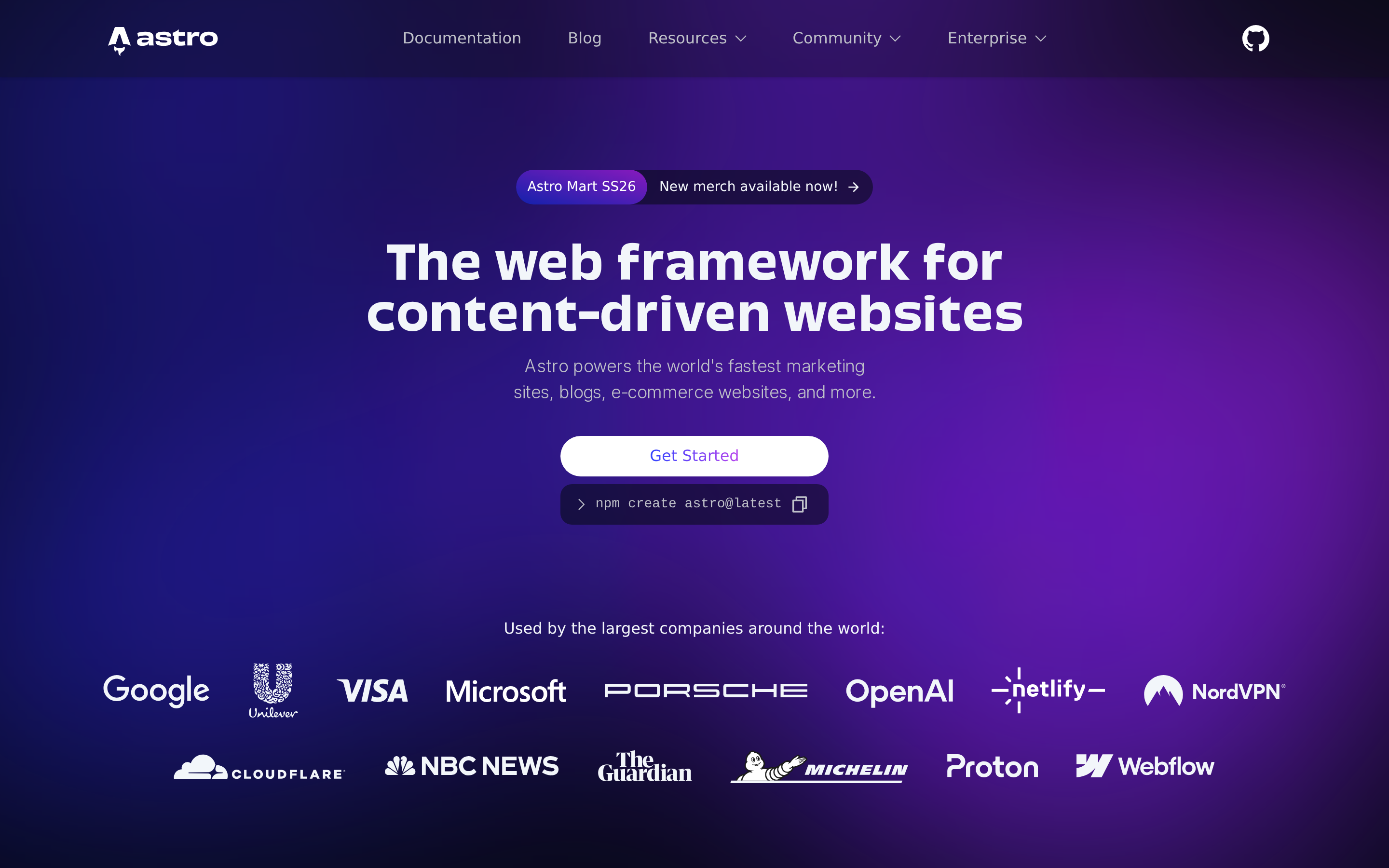
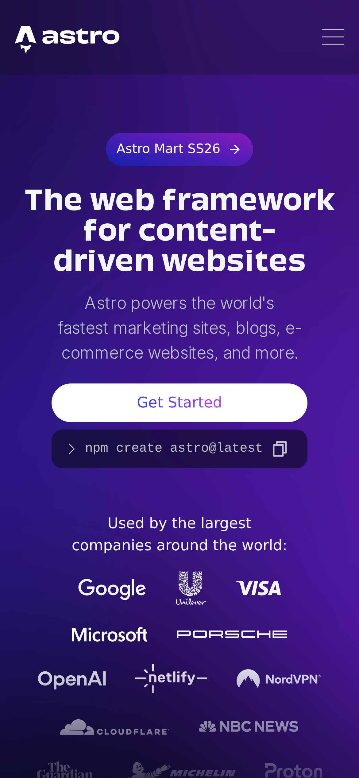
astro.build is built on a near-black canvas (rgb(12, 15, 25)). The system uses rgb(97, 218, 251) as the high-saturation accent for primary actions. Fully-rounded CTAs (9999px) signal a friendly, tactile interaction model alongside Obviously as the primary typeface. A layered elevation system (4 distinct shadows) building a clear front-to-back hierarchy. Interactions are smoothed by transitions across many elements, with little or no keyframe animation.

01

Color — roles, semantics & the full census

63 colors measured · click any swatch to copy

Canvas
#0c0f19
AAA 17.61:1
Ink
#f2f6fa
AAA 17.61:1
Accent
#61dafb
AAA 11.78:1
Line
#858b98
AA 5.6:1
Semantic states

No semantic state colors detected — this system signals state through weight & motion, not hue.

63 colors mined from the live renderexpand
02

Type — the ladder, in the real face

4 roles · rendered live in the real Inter (captured woff2) · lines are editable, click any spec to copy

display xl
display-xl48px · 700
display md
display-md16px · 600 · ×3.00
body
body16px · 400 · ×1.00
button
button16px · 300 · ×1.00
03

Spacing & radius, made spatial

9 spacing steps · 7 radii · bars are exact px widths

Spacing scale
xxs · 2px
xs · 4px
sm · 8px
md · 12px
base · 16px
lg · 24px
xl · 32px
2xl · 48px
3xl · 80px
Radius
none
0px
xs
4px
sm
8px
md
12px
lg
20px
xl
9999px
full
9999px
04

Depth — elevation is extracted, not invented

4 box-shadows measured on the live page · click a tile to copy its raw value

shadow-1
shadow-2
shadow-3
05

Motion — easings, transitions & live keyframes

2 easing curves · 2 keyframes · hover a tile to preview

Easing & transitions
transition-3cubic-bezier(0, 0, 0.2, 1)
transition-4cubic-bezier(0.4, 0, 0.2, 1)
2 keyframe animations extracted
float
marquee
06

Components — the closed vocabulary

13 component families · 60 variants counted on the live DOM

ComponentVariants found
buttons×10
links×10
cards×9
heading H2×7
nav Links×6
tabs×5
footer Links×3
code Block×3
inputs×2
accordion×2
badges×1
heading H1×1
heading H3×1
Component style specs (§4)expand

Buttons

Pill

  • Background: #0c0f19 {colors.canvas}
  • Text: #ffffff {colors.ink-subtle}
  • Padding: 8px 16px
  • Radius: 9999px
  • Border: 1px solid rgba(133, 139, 152, 0.2)
  • Font: 16px weight 600
  • Use: Status pills, tags, chips

Ghost

  • Background: transparent
  • Text: #bfc1c9 {colors.ink-muted}
  • Padding: 12px
  • Radius: 6px
  • Font: 16px weight 400
  • Use: Subtle action, toolbar, nav button

Pill

  • Background: rgba(6, 9, 19, 0.55)
  • Text: #f2f6fa {colors.ink}
  • Padding: 0px
  • Radius: 9999px
  • Font: 16px weight 400
  • Use: Status pills, tags, chips

Icon Button

  • Background: #17191e
  • Text: #ffffff {colors.ink-subtle}
  • Padding: 0px
  • Radius: 3.2px
  • Font: 13.3333px weight 400
  • Use: Toolbar/UI icons

Primary Brand

  • Background: #61dafb {colors.primary}
  • Text: #030712
  • Padding: 8px 16px
  • Radius: 8px
  • Font: 16px weight 400
  • Use: Primary CTA / brand action

Cards & Containers

Standard Card

  • Background: #0c0f19 {colors.canvas}
  • Padding: 0px
  • Radius: 16px
  • Border: 1px solid rgba(133, 139, 152, 0.2)
  • Use: Content containers, listing items
  • Hover: border: 1px solid rgba(133, 139, 152, 0.4), borderColor: #858b98

Inputs & Forms

Text Input

  • Background: #060913
  • Text: #f2f6fa {colors.ink}
  • Padding: 4px 12px
  • Radius: 8px
07

Layout — structure & dimensions

4 layout metrics measured

header 80px 1200px max-width
max Width1200px
header Height80px
sidebar Width0px
container Padding0px
08

Responsive — real breakpoints

5 media-query stops read from the live CSS

640px
768px
1024px
1280px
1536px
09

Do's & Don'ts

25 enforceable rules pulled verbatim from the spec

Do
Use dark background (`#0c0f19`) as the foundation — this is a dark-mode-native design
Use ui-sans-serif as the primary typeface — it defines the brand personality
Use the extracted shadow patterns for elevation — they are tuned to match the brand palette
Use full-pill radius (9999px) only for specific elements (avatars, pills, toggles)
Use #61dafb (`#61dafb`) as the primary accent — it's the brand's signature interactive color
Use 8px border-radius on buttons — the standard corner rounding for interactive elements
Use 16px border-radius on cards — consistent with the grid card corners
Style form inputs with a `1px solid rgb(35, 38, 45)` border — use border-based inputs, not floating labels or underline-only
Maintain nav height at 80px — consistent vertical space for the navigation bar
Respect the 4px–32px spacing range — the design uses a wide scale for visual breathing room
Make the hero full-viewport (≥70% screen height) — this design uses an immersive hero, not a tall navbar
Include exactly 2 CTAs in the hero (primary + secondary) — this design pattern is multi-action, not single-purpose
Each card includes a top image — imagery is part of the card identity, not optional
Use a 4-column grid on desktop — density matters for this content type
Use expandable accordion for the FAQ — saves vertical space and lets users self-navigate
Include a newsletter signup in the footer — email capture is part of the conversion funnel
Don't
Don't use light backgrounds — the dark canvas is the native medium
Don't substitute with generic sans-serif or serif — the custom font carries the brand
Don't invent new shadow values — use only the extracted shadow levels
Don't apply pill radius on rectangular buttons or cards — it's reserved for specific interactive elements
Don't introduce additional saturated accent colors — the palette is intentionally controlled
Don't remove the input border — the border is the primary affordance indicator for form fields
Don't collapse or hide the nav on scroll without an explicit scroll-triggered animation — the design uses fixed nav presence
Don't make the nav sticky — this design lets it scroll away to maximize content focus
Don't put a CTA button in the nav — this design uses links only at the top
10

Agent guide & export

Paste-ready prompt + the real files behind this page

Build a UI in the astro.build design system. Canvas #0c0f19 · ink #f2f6fa · accent #61dafb. Type: MDIO — respect the size/weight ladder in §3. Radius, spacing, shadow: use only the extracted scales (no magic numbers). Full spec follows — paste the DESIGN.md below into your agent.
Every value above was getComputedStyle-verified.
$ npx prismd add astro
DESIGN.md · narrative spec tokens.json