prismdinstrument
EXTRACTED · 10 SECTIONS · 29 COLORS · GRADE B

zapier.com

Accent #4b4be6 · Inter — every value below measured via getComputedStyle(), not asserted by hand.

29
colors
7
faces
2
shadows
4
keyframes
zapier.com
real render · source of truth

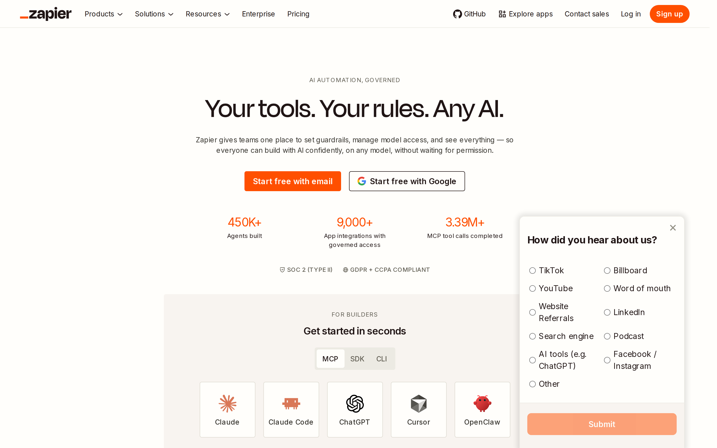
zapier.com is built on a warm, off-white canvas (rgb(255, 254, 251)). The system uses rgb(255, 79, 0) as the high-saturation accent for primary actions. Crisp CTAs (4px radius) reinforce a precise, technical aesthetic alongside Degular Display as the primary typeface. Degular Display is paired with Inter Fallback for secondary roles. A restrained elevation system (2 distinct shadows) — shadows reserved for the few elements that must lift off the page. Motion is minimal — a few targeted transitions, no decorative animation.

01

Color — roles, semantics & the full census

29 colors measured · click any swatch to copy

Canvas
#fffefb
AAA 17.65:1
Ink
#201515
AAA 17.65:1
Accent
#4b4be6
AA 6.04:1
Line
#605d52
AA 6.54:1
Semantic states

No semantic state colors detected — this system signals state through weight & motion, not hue.

29 colors mined from the live renderexpand
02

Type — the ladder, in the real face

7 roles · rendered live in the real Inter (captured woff2) · lines are editable, click any spec to copy

display xl
display-xl56px · 500
display md
display-md28px · 300 · ×2.00
body
body12px · 500 · ×2.33
caption
caption12px · 500 · ×1.00
button
button14px · 400 · ×0.86
eyebrow
eyebrow12px · 400 · ×1.17
mono
mono13.3333px · 400 · ×0.90
04

Depth — elevation is extracted, not invented

2 box-shadows measured on the live page · click a tile to copy its raw value

shadow-1
shadow-2
05

Motion — easings, transitions & live keyframes

1 easing curve · 4 keyframes · hover a tile to preview

Easing & transitions
transition-3ease-in-out
4 keyframe animations extracted
onetrust-fade-in
intercom-lightweight-app-launcher
intercom-lightweight-app-gradient
intercom-lightweight-app-messenger
03

Spacing & radius, made spatial

9 spacing steps · 7 radii · bars are exact px widths

Spacing scale
xxs · 2px
xs · 4px
sm · 8px
md · 12px
base · 16px
lg · 24px
xl · 32px
2xl · 48px
3xl · 64px
Radius
none
0px
xs
4px
sm
8px
md
16px
lg
18px
xl
32px
full
9999px
06

Components — the closed vocabulary

17 component families · 63 variants counted on the live DOM

ComponentVariants found
heading H2×10
eyebrow Labels×8
logo Tile×7
cards×6
tabs×6
accordion×5
heading H3×4
buttons×2
status Badge×2
nav Links×2
cta Banner×2
links×2
captions×2
divider×2
inputs×1
footer Links×1
heading H1×1
Component style specs (§4)expand

Buttons

Ghost

  • Background: transparent
  • Text: #201515 {colors.primary-focus}
  • Padding: 6px 10px
  • Radius: 4px
  • Font: 14px weight 400
  • Use: Subtle action, toolbar, nav button
  • Focus: outline: rgb(32, 21, 21) dashed 3px

Pill

  • Background: #ff4f00 {colors.primary}
  • Text: #fffefb {colors.background}
  • Padding: 6px 12px
  • Radius: 18px
  • Border: 1px solid rgb(255, 79, 0)
  • Font: 14px weight 600
  • Use: Status pills, tags, chips
  • Focus: outline: rgb(32, 21, 21) dashed 3px

Secondary

  • Background: #381933
  • Text: #fffefb {colors.background}
  • Padding: 4px 16px 8px
  • Radius: 0px 0px 6px 6px
  • Font: 14px weight 400
  • Use: Secondary action
  • Focus: outline: rgb(32, 21, 21) dashed 3px

Cards & Containers

Standard Card

  • Background: #f8f4f0 {colors.surface-1}
  • Padding: 24px
  • Radius: 0px
  • Use: Content containers, listing items

Inputs & Forms

Text Input

  • Background: #fffefb {colors.background}
  • Text: #201515 {colors.primary-focus}
  • Padding: 8px 12px
  • Radius: 4px
  • Border: 1px solid rgb(197, 192, 177)
  • Font: 16px weight 400
  • Use: Text fields, search inputs

Navigation

Main Nav

  • Background: #fffefb {colors.background}
  • Padding: 0px 40px
  • Radius: none
  • Font: 16px weight 400
  • Use: Fixed/sticky block nav — N/A items

Status Badges

07

Layout — structure & dimensions

4 layout metrics measured

header 56px 1200px max-width
max Width1200px
header Height56px
sidebar Width0px
container Padding0px
08

Responsive — real breakpoints

11 media-query stops read from the live CSS

400px
425px
426px
450px
476px
530px
550px
600px
768px
896px
1024px
09

Do's & Don'ts

25 enforceable rules pulled verbatim from the spec

Do
Use Pure White (`#fffefb`) as the page background — it's intentionally not pure white
Use Near Black (`#201515`) for text — not pure black, it's warmer and more readable
Use Inter as the primary typeface — it defines the brand personality
Keep font weights between 400-500 — the system uses a narrow weight range for subtle hierarchy
Use the extracted shadow patterns for elevation — they are tuned to match the brand palette
Use Bright Orange (`#ff4f00`) as the primary accent — it's the brand's signature interactive color
Use 18px border-radius on buttons — the standard corner rounding for interactive elements
Apply 24px padding inside cards — matches the design system's content breathing room
Style form inputs with a `1px solid rgb(197, 192, 177)` border — use border-based inputs, not floating labels or underline-only
Respect the 4px–32px spacing range — the design uses a wide scale for visual breathing room
Make the hero full-viewport (≥70% screen height) — this design uses an immersive hero, not a tall navbar
Include exactly 10 CTAs in the hero (primary + secondary) — this design pattern is multi-action, not single-purpose
Each card includes a top image — imagery is part of the card identity, not optional
Place 2 pricing tiers side-by-side on desktop — direct comparison is the value prop
Lay out testimonials in a grid (12+ items) — quantity signals scale and trust
Repeat the primary CTA across 5 banner sections — conversion paths are layered, not single
Don't
Don't use pure white (`#ffffff`) as a page background — the warm tone is part of the brand identity
Don't use pure black (`#000000`) for text — the near-black adds warmth
Don't substitute with generic sans-serif or serif — the custom font carries the brand
Don't use weight 700 (bold) or above — 500 is the maximum weight in this system
Don't invent new shadow values — use only the extracted shadow levels
Don't introduce additional saturated accent colors — the palette is intentionally controlled
Don't remove the input border — the border is the primary affordance indicator for form fields
Don't make the nav sticky — this design lets it scroll away to maximize content focus
Don't put a CTA button in the nav — this design uses links only at the top
10

Agent guide & export

Paste-ready prompt + the real files behind this page

Build a UI in the zapier.com design system. Canvas #fffefb · ink #201515 · accent #4b4be6. Type: Inter — respect the size/weight ladder in §3. Radius, spacing, shadow: use only the extracted scales (no magic numbers). Full spec follows — paste the DESIGN.md below into your agent.
Every value above was getComputedStyle-verified.
$ npx prismd add zapier
DESIGN.md · narrative spec tokens.json
A · InstrumentB · Press