prismdinstrument
EXTRACTED · 9 SECTIONS · 31 COLORS · GRADE C

turso.tech

Accent #5e6ad2 · __Inter_f367f3 — every value below measured via getComputedStyle(), not asserted by hand.

31
colors
1
face
11
keyframes
5
breakpoints
turso.tech
real render · source of truth

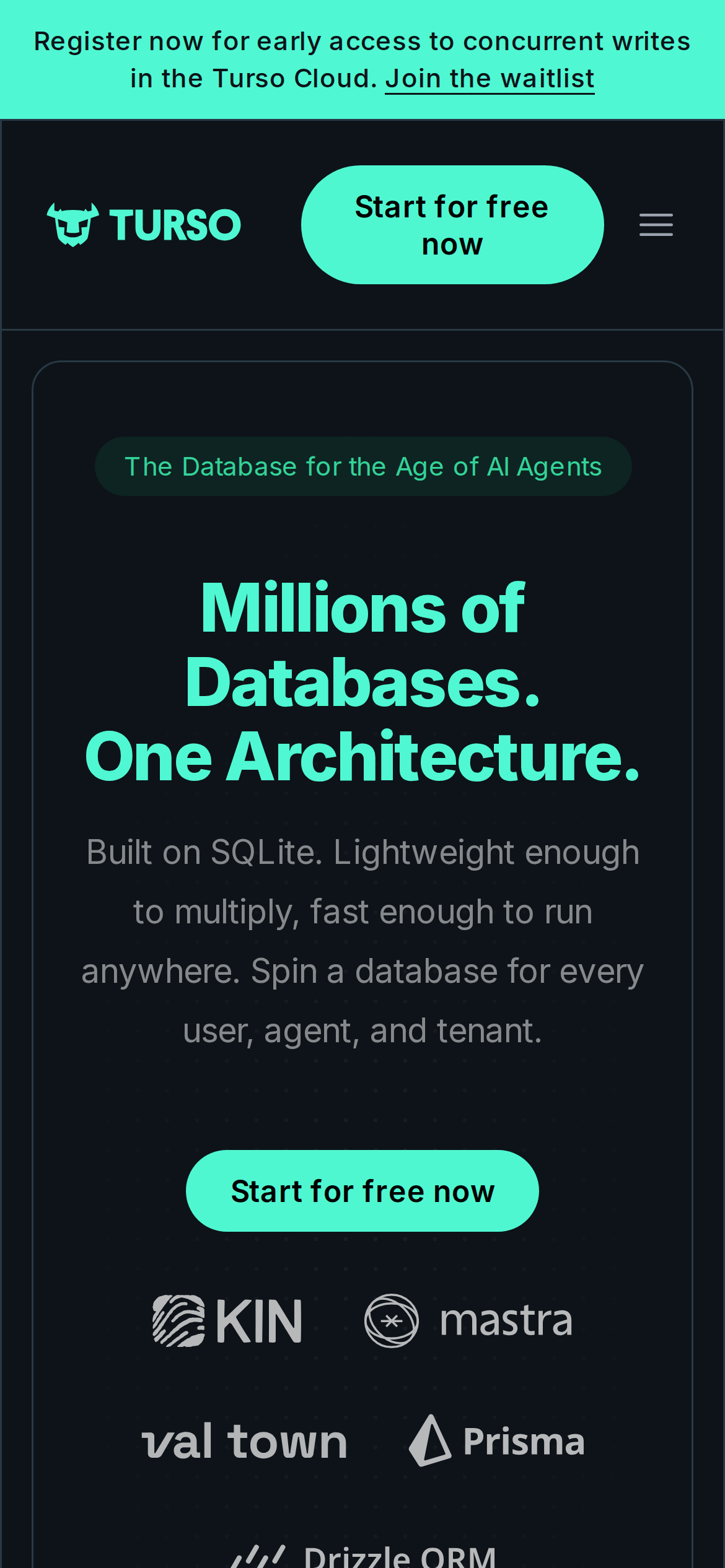
turso.tech is built on a near-black canvas (rgb(13, 19, 24)). The system uses rgb(79, 247, 209) as the high-saturation accent for primary actions. Fully-rounded CTAs (9999px) signal a friendly, tactile interaction model alongside __Inter_f367f3 as the primary typeface. __Inter_f367f3 is paired with __Inter_Fallback_f367f3 for secondary roles. Depth comes from borders and surface contrast rather than shadows — a flat, structural elevation model. Motion is a first-class concern — 11 keyframe animations plus transition-driven interactions.

01

Color — roles, semantics & the full census

31 colors measured · click any swatch to copy

Canvas
#0d1318
AAA 18.69:1
Ink
#ffffff
AAA 18.69:1
Accent
#4ff7d1
AAA 13.85:1
Line
#ffffff
AAA 18.69:1
Semantic states

No semantic state colors detected — this system signals state through weight & motion, not hue.

31 colors mined from the live renderexpand
02

Type — the ladder, in the real face

6 roles · rendered live in the real Inter (captured woff2) · lines are editable, click any spec to copy

display xl
display-xl72px · 800
display md
display-md48px · 600 · ×1.50
headline
headline18px · 600 · ×2.67
body
body16px · 400 · ×1.13
body sm
body-sm16px · 500 · ×1.00
button
button16px · 600 · ×1.00
05

Motion — easings, transitions & live keyframes

1 easing curve · 11 keyframes · hover a tile to preview

Easing & transitions
transition-2cubic-bezier(0.4, 0, 0.2, 1)
11 keyframe animations extracted
ping
spin
bounceLinear
floating
go2264125279
go3020080000
go463499852
go1268368563
go1310225428
go651618207
go901347462
03

Spacing & radius, made spatial

9 spacing steps · 7 radii · bars are exact px widths

Spacing scale
xxs · 2px
xs · 10px
sm · 16px
md · 24px
base · 80px
lg · 88px
xl · 96px
2xl · 104px
3xl · 112px
Radius
none
0px
xs
6px
sm
12px
md
16px
lg
24px
xl
9999px
full
9999px
06

Components — the closed vocabulary

8 component families · 37 variants counted on the live DOM

ComponentVariants found
buttons×10
links×10
nav Links×5
heading H2×4
heading H3×3
footer Links×2
heading H4×2
code Block×1
Component style specs (§4)expand

Buttons

Ghost

  • Background: transparent
  • Text: #9ca3af
  • Padding: 10px
  • Radius: 6px
  • Font: 16px weight 400
  • Use: Subtle action, toolbar, nav button

Pill

  • Background: transparent
  • Text: #ffffff {colors.hairline}
  • Padding: 8px 16px
  • Radius: 9999px
  • Font: 16px weight 600
  • Use: Status pills, tags, chips

Pill

  • Background: #d946ef
  • Text: #ffffff {colors.hairline}
  • Padding: 10px 14px
  • Radius: 9999px
  • Font: 16px weight 600
  • Use: Status pills, tags, chips

Secondary

  • Background: #162129
  • Text: #ffffff {colors.hairline}
  • Padding: 16px
  • Radius: 12px
  • Border: 1px solid rgb(40, 57, 69)
  • Font: 16px weight 400
  • Use: Secondary action
07

Layout — structure & dimensions

5 layout metrics measured

header 92px 1280px max-width
max Width1280px
header Height92px
sidebar Width0px
gap16px
container Padding24px
08

Responsive — real breakpoints

5 media-query stops read from the live CSS

640px
768px
1024px
1280px
1536px
09

Do's & Don'ts

15 enforceable rules pulled verbatim from the spec

Do
Use dark background (`#0d1318`) as the foundation — this is a dark-mode-native design
Use full-pill radius (9999px) only for specific elements (avatars, pills, toggles)
Use #4ff7d1 (`#4ff7d1`) as the primary accent — it's the brand's signature interactive color
Use pill-shaped radius (9999px) for primary CTA buttons — the brand uses fully-rounded, pill CTAs
Maintain nav height at 92px — consistent vertical space for the navigation bar
Respect the 10px–96px spacing range — the design uses a wide scale for visual breathing room
Each card includes a top image — imagery is part of the card identity, not optional
Use a 4-column grid on desktop — density matters for this content type
Lay out testimonials in a grid (6+ items) — quantity signals scale and trust
Don't
Don't use light backgrounds — the dark canvas is the native medium
Don't apply pill radius on rectangular buttons or cards — it's reserved for specific interactive elements
Don't introduce additional saturated accent colors — the palette is intentionally controlled
Don't use rectangular buttons for primary actions — the rounded pill shape is the brand standard
Don't collapse or hide the nav on scroll without an explicit scroll-triggered animation — the design uses fixed nav presence
Don't make the nav sticky — this design lets it scroll away to maximize content focus
10

Agent guide & export

Paste-ready prompt + the real files behind this page

Build a UI in the turso.tech design system. Canvas #0d1318 · ink #ffffff · accent #4ff7d1. Type: __Inter_f367f3 — respect the size/weight ladder in §3. Radius, spacing, shadow: use only the extracted scales (no magic numbers). Full spec follows — paste the DESIGN.md below into your agent.
Every value above was getComputedStyle-verified.
$ npx prismd add turso
DESIGN.md · narrative spec tokens.json
A · InstrumentB · Press