hono.dev
Accent #5e6ad2 · -apple-system — every value below measured via getComputedStyle(), not asserted by hand.
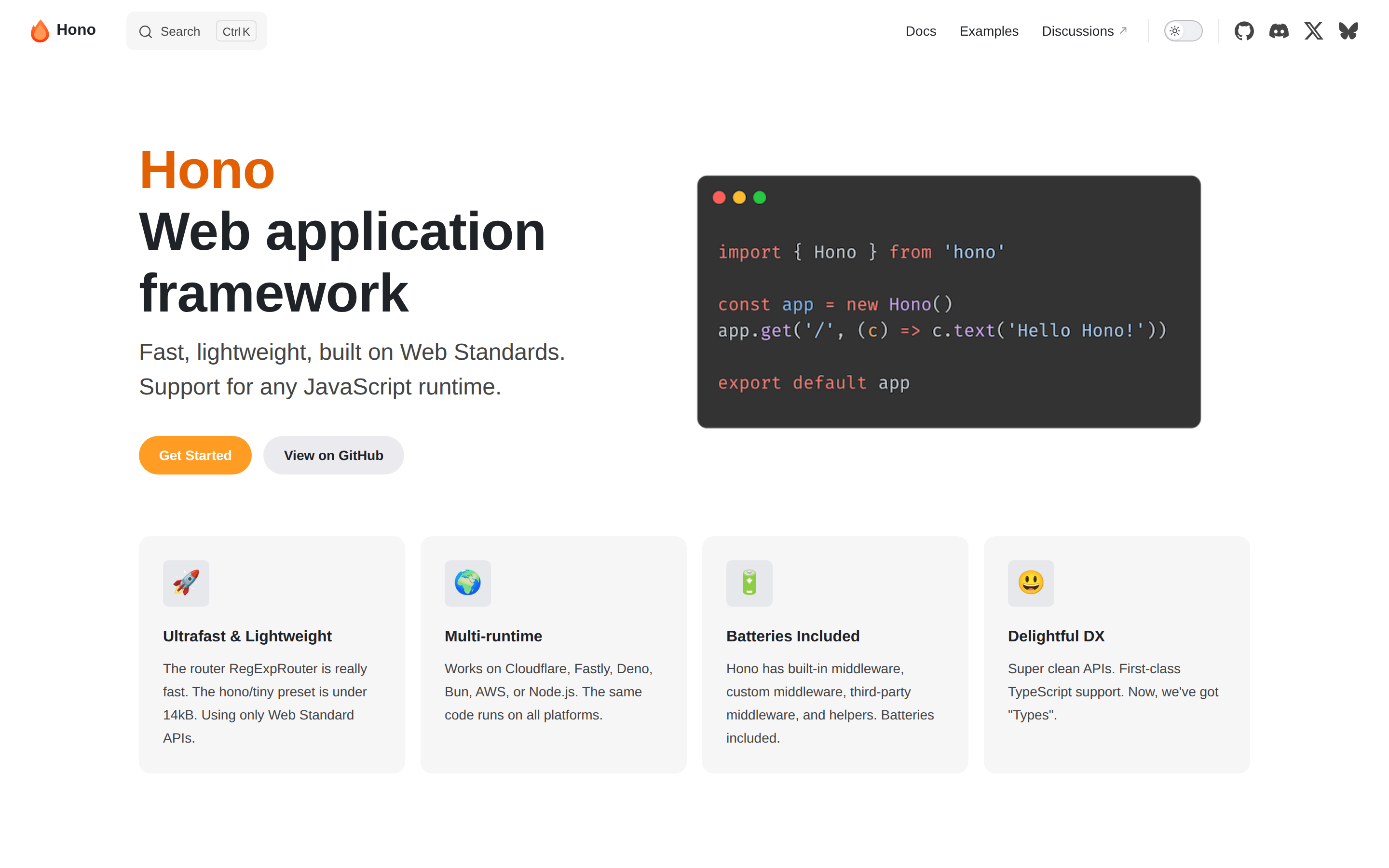
hono.dev is built on a pure-white canvas (rgb(255, 255, 255)). The system uses rgb(246, 246, 247) as a near-neutral accent (low saturation). Moderately rounded CTAs (8px) — modern SaaS standard, neither sharp nor pill alongside -apple-system as the primary typeface. A restrained elevation system (2 distinct shadows) — shadows reserved for the few elements that must lift off the page. Interactions are smoothed by transitions across many elements, with little or no keyframe animation.
Color — roles, semantics & the full census
10 colors measured · click any swatch to copy
4 semantic roles found.
10 colors mined from the live renderexpand
Type — the ladder, in the real face
6 roles · rendered live in the real Inter (captured woff2) · lines are editable, click any spec to copy
Depth — elevation is extracted, not invented
2 box-shadows measured on the live page · click a tile to copy its raw value
Motion — easings, transitions & live keyframes
0 easing curves · 1 keyframes · hover a tile to preview
Spacing & radius, made spatial
9 spacing steps · 7 radii · bars are exact px widths
0px
6px
8px
12px
20px
32px
9999px
Components — the closed vocabulary
7 component families · 15 variants counted on the live DOM
| Component | Variants found |
|---|---|
| links | ×6 |
| nav Links | ×3 |
| buttons | ×2 |
| cards | ×1 |
| badges | ×1 |
| heading H1 | ×1 |
| heading H2 | ×1 |
Component style specs (§4)expand
Buttons
Light / Invert
- Background:
#f6f6f7{colors.primary} - Text:
#454545{colors.hairline} - Padding: 0px 10px 0px 12px
- Radius: 8px
- Border: 1px solid rgba(0, 0, 0, 0)
- Font: 13.3333px weight 500
- Use: Bright CTA on dark sections
- Hover: backgroundColor:
#ffffff, color:#1f2328, outline:rgb(31, 35, 40) none 3px - Focus: backgroundColor:
rgba(0, 0, 0, 0), color:rgb(31, 35, 40), border:1px solid rgba(227, 96, 2, 0.05)
Pill
- Background:
rgba(142, 150, 170, 0.14) - Text:
#1f2328{colors.ink} - Padding: 0px
- Radius: 11px
- Border: 1px solid rgba(60, 60, 67, 0.29)
- Font: 13.3333px weight 400
- Use: Status pills, tags, chips
- Hover: backgroundColor:
#ffffff, color:#1f2328, outline:rgb(31, 35, 40) none 3px - Focus: backgroundColor:
rgba(0, 0, 0, 0), color:rgb(31, 35, 40), border:1px solid rgba(227, 96, 2, 0.05)
Pill
- Background:
#ffffff{colors.background} - Text:
#e36002 - Padding: 8px 16px
- Radius: 8px
- Shadow:
rgba(0, 0, 0, 0.1) 0px 12px 32px 0px, rgba(0, 0, 0, 0.08) 0px 2px 6px 0px - Font: 12px weight 700
- Use: Status pills, tags, chips
- Hover: backgroundColor:
#ffffff, color:#1f2328, outline:rgb(31, 35, 40) none 3px - Focus: backgroundColor:
rgba(0, 0, 0, 0), color:rgb(31, 35, 40), border:1px solid rgba(227, 96, 2, 0.05)
Cards & Containers
Standard Card
- Background:
transparent - Padding: 24px
- Radius: 0px
- Use: Content containers, listing items
Layout — structure & dimensions
5 layout metrics measured
Responsive — real breakpoints
8 media-query stops read from the live CSS
Do's & Don'ts
17 enforceable rules pulled verbatim from the spec
Agent guide & export
Paste-ready prompt + the real files behind this page