prismdinstrument
EXTRACTED · 10 SECTIONS · 55 COLORS · GRADE A

deno.com

Accent #5e6ad2 · Inter — every value below measured via getComputedStyle(), not asserted by hand.

55
colors
6
faces
7
shadows
22
keyframes
deno.com
real render · source of truth

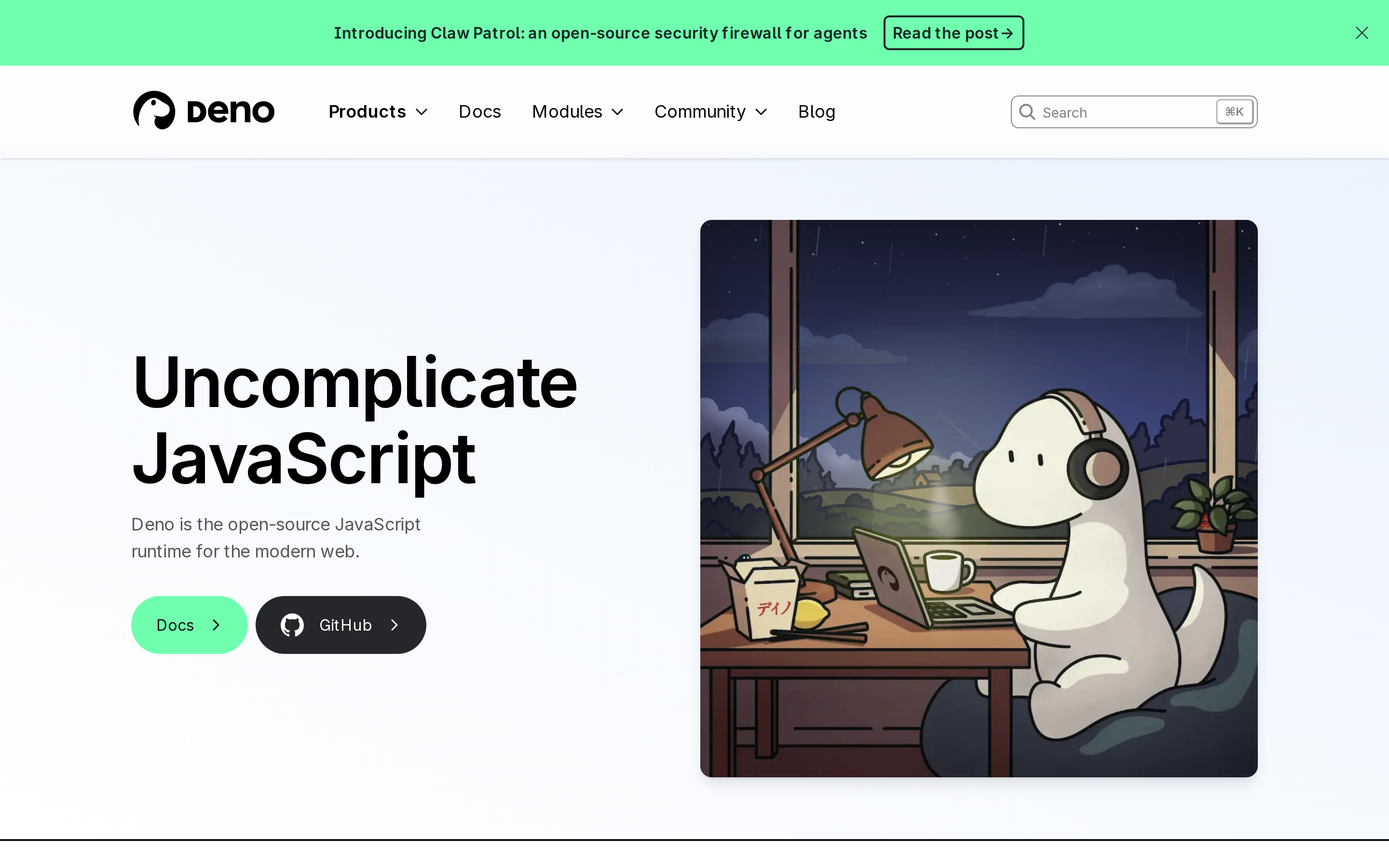
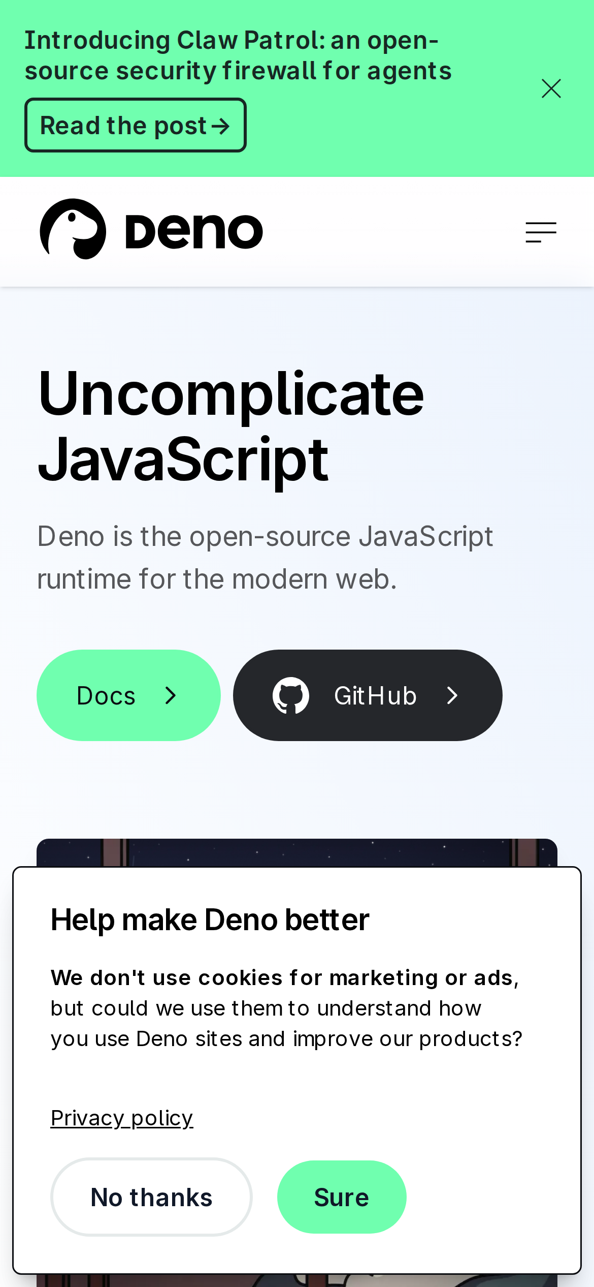
deno.com is built on a mid-dark canvas (oklab(0.999994 0.0000455678 0.0000200868 / 0.9)). The system uses rgb(112, 255, 175) as the accent for primary actions and brand signals. Sharp 0px corners on CTAs — architectural restraint, engineering precision alongside Inter as the primary typeface. A layered elevation system (7 distinct shadows) building a clear front-to-back hierarchy. Motion is a first-class concern — 22 keyframe animations plus transition-driven interactions.

01

Color — roles, semantics & the full census

55 colors measured · click any swatch to copy

Canvas
#ffffff
AAA 18.88:1
Ink
#111111
AAA 18.88:1
Accent
#70ffaf
Fail 1.26:1
Line
#868789
AA·lg 3.6:1
Semantic states
error#d1242f

1 semantic role found.

55 colors mined from the live renderexpand
02

Type — the ladder, in the real face

6 roles · rendered live in the real Inter (captured woff2) · lines are editable, click any spec to copy

display xl
display-xl72px · 700
display md
display-md36px · 700 · ×2.00
headline
headline20px · 700 · ×1.80
body
body16px · 400 · ×1.25
caption
caption13.6px · 400 · ×1.18
button
button18px · 700 · ×0.76
04

Depth — elevation is extracted, not invented

7 box-shadows measured on the live page · click a tile to copy its raw value

shadow-1
shadow-2
shadow-3
shadow-4
shadow-5
05

Motion — easings, transitions & live keyframes

3 easing curves · 22 keyframes · hover a tile to preview

Easing & transitions
transition-2cubic-bezier(0.4, 0, 0.2, 1)
default-transition-timing-functioncubic-bezier(.4,0,.2,1)
ease-outcubic-bezier(0,0,.2,1)
22 keyframe animations extracted
spin
move
buttonBorderSpin
firstHalfBorderSpin
secondHalfBorderSpin
badgeBorderSpin
fadeInSlideUp
fadeIn
infra-border-fade
infra-desaturate
infra-scale-y
dino-peek
03

Spacing & radius, made spatial

9 spacing steps · 7 radii · bars are exact px widths

Spacing scale
xxs · 2px
xs · 4px
sm · 8px
md · 24px
base · 32px
lg · 48px
xl · 56px
2xl · 64px
3xl · 144px
Radius
none
0px
xs
4px
sm
8px
md
12px
lg
9997px
xl
9999px
full
9997px
06

Components — the closed vocabulary

14 component families · 65 variants counted on the live DOM

ComponentVariants found
buttons×10
heading H3×10
links×10
code Block×10
heading H2×6
footer Links×5
timeline Pill×3
badges×2
nav Links×2
cta Banner×2
heading H4×2
inputs×1
heading H1×1
captions×1
Component style specs (§4)expand

Buttons

Outline

  • Background: transparent
  • Text: #172723 {colors.ink-muted}
  • Padding: 4px 8px
  • Radius: 6px
  • Border: 2px solid rgb(23, 39, 35)
  • Font: 16px weight 700
  • Use: Secondary action with border
  • Focus: outline: rgb(174, 1, 255) solid 2px

Ghost

  • Background: transparent
  • Text: #000000
  • Padding: 0px 8px
  • Radius: 6px
  • Font: 18px weight 700
  • Use: Subtle action, toolbar, nav button
  • Focus: outline: rgb(174, 1, 255) solid 2px

Ghost

  • Background: transparent
  • Text: #56575a
  • Padding: 12px 16px
  • Radius: 9999px
  • Font: 14px weight 400
  • Use: Subtle action, toolbar, nav button
  • Focus: outline: rgb(174, 1, 255) solid 2px

Inputs & Forms

Text Input

  • Background: transparent
  • Text: #000000
  • Padding: 4px 4px 4px 32px
  • Radius: 8px
  • Border: 1px solid rgb(134, 135, 137)
  • Font: 16px weight 400
  • Use: Text fields, search inputs

Navigation

Main Nav

  • Background: #ffffff {colors.background}
  • Padding: 0px
  • Radius: none
  • Shadow: rgba(0, 0, 0, 0.1) 0px 1px 3px 0px, rgba(0, 0, 0, 0.1) 0px 1px 2px -1px
  • Font: 18px weight 400
  • Use: Fixed/sticky flex nav — N/A items

CTA Banners

Full-width CTA

  • Background: #66c2ff
  • Text: #002633
  • Padding: 12px 20px
  • Radius: 8px
  • Font: 18px weight 700
  • Use: Full-width conversion strip with headline + button
07

Layout — structure & dimensions

4 layout metrics measured

header 96px 1080px max-width
max Width1080px
header Height96px
sidebar Width0px
container Padding0px
08

Responsive — real breakpoints

3 media-query stops read from the live CSS

768px
1024px
1080px
09

Do's & Don'ts

22 enforceable rules pulled verbatim from the spec

Do
Use Inter as the primary typeface — it defines the brand personality
Use negative letter-spacing (-1.8px) at display sizes for compressed, editorial headlines
Use the extracted shadow patterns for elevation — they are tuned to match the brand palette
Use full-pill radius (9999px) only for specific elements (avatars, pills, toggles)
Use Runtime (`#70ffaf`) as the primary accent — it's the brand's signature interactive color
Use pill-shaped radius (9999px) for primary CTA buttons — the brand uses fully-rounded, pill CTAs
Style form inputs with a `1px solid rgb(134, 135, 137)` border — use border-based inputs, not floating labels or underline-only
Maintain nav height at 48px — consistent vertical space for the navigation bar
Respect the 4px–56px spacing range — the design uses a wide scale for visual breathing room
Include exactly 2 CTAs in the hero (primary + secondary) — this design pattern is multi-action, not single-purpose
Include a search input directly in the nav — discoverability is a primary UX value here
Lay out testimonials in a grid (7+ items) — quantity signals scale and trust
Don't
Don't substitute with generic sans-serif or serif — the custom font carries the brand
Don't increase letter-spacing on headings — the type is designed to run tight at scale
Don't invent new shadow values — use only the extracted shadow levels
Don't apply pill radius on rectangular buttons or cards — it's reserved for specific interactive elements
Don't introduce additional saturated accent colors — the palette is intentionally controlled
Don't use rectangular buttons for primary actions — the rounded pill shape is the brand standard
Don't remove the input border — the border is the primary affordance indicator for form fields
Don't collapse or hide the nav on scroll without an explicit scroll-triggered animation — the design uses fixed nav presence
Don't make the nav sticky — this design lets it scroll away to maximize content focus
Don't put a CTA button in the nav — this design uses links only at the top
10

Agent guide & export

Paste-ready prompt + the real files behind this page

Build a UI in the deno.com design system. Canvas #ffffff · ink #111111 · accent #70ffaf. Type: Inter — respect the size/weight ladder in §3. Radius, spacing, shadow: use only the extracted scales (no magic numbers). Full spec follows — paste the DESIGN.md below into your agent.
Every value above was getComputedStyle-verified.
A · InstrumentB · Press