prismdinstrument
EXTRACTED · 10 SECTIONS · 39 COLORS · GRADE A

clay.com

Accent #3859f9 · Roobertvf — every value below measured via getComputedStyle(), not asserted by hand.

39
colors
6
faces
2
shadows
9
keyframes
clay.com
real render · source of truth

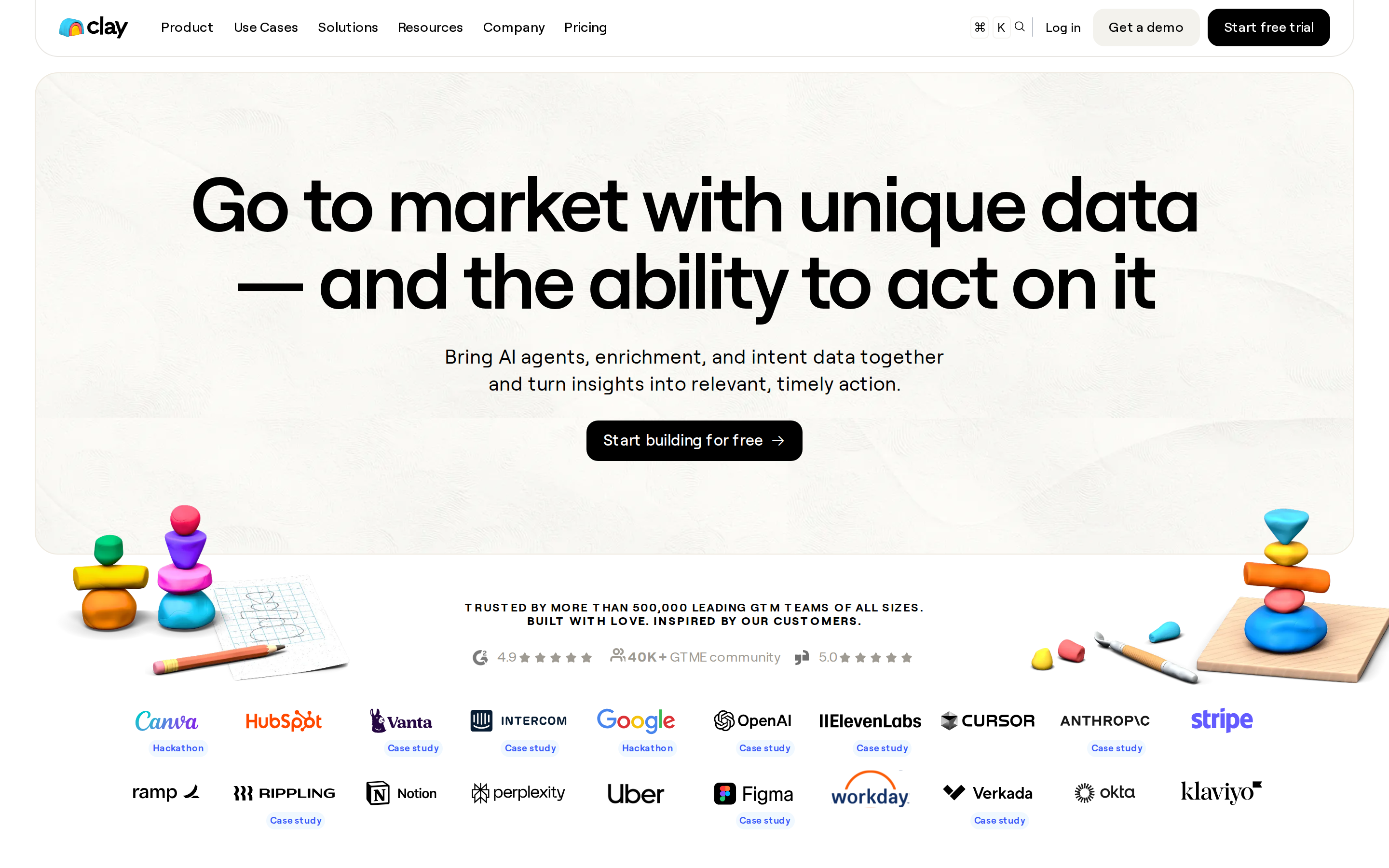
clay.com is built on a pure-white canvas (rgb(255, 255, 255)). The system uses rgb(255, 255, 255) as the singular interactive color. Sharp 0px corners on CTAs — architectural restraint, engineering precision alongside Roobertvf as the primary typeface. Roobertvf is paired with Phosphor for secondary roles. A restrained elevation system (2 distinct shadows) — shadows reserved for the few elements that must lift off the page. Motion is a first-class concern — 9 keyframe animations plus transition-driven interactions.

01

Color — roles, semantics & the full census

39 colors measured · click any swatch to copy

Canvas
#ffffff
AAA 18.88:1
Ink
#111111
AAA 18.88:1
Accent
#ffffff
Fail 1:1
Line
#d1cdc7
Fail 1.58:1
Semantic states

No semantic state colors detected — this system signals state through weight & motion, not hue.

39 colors mined from the live renderexpand
02

Type — the ladder, in the real face

7 roles · rendered live in the real Roobert (captured woff2) · lines are editable, click any spec to copy

display xl
display-xl80px · 600
display md
display-md32px · 600 · ×2.50
body
body10px · 600 · ×3.20
body sm
body-sm12.8px · 500 · ×0.78
caption sm
caption-sm10px · 600 · ×1.28
button
button16px · 500 · ×0.63
eyebrow
eyebrow12px · 600 · ×1.33
04

Depth — elevation is extracted, not invented

2 box-shadows measured on the live page · click a tile to copy its raw value

shadow-1
05

Motion — easings, transitions & live keyframes

4 easing curves · 9 keyframes · hover a tile to preview

Easing & transitions
transition-2cubic-bezier(0.165, 0.84, 0.44, 1)
transition-3ease-in-out
transition-4ease-out
transition-5cubic-bezier(0.075, 0.82, 0.165, 1)
9 keyframe animations extracted
spin
load
marquee
fadein
marquee-up
marquee-down
logos-marquee
pulse
bouncy
03

Spacing & radius, made spatial

9 spacing steps · 7 radii · bars are exact px widths

Spacing scale
xxs · 2px
xs · 4px
sm · 8px
md · 12px
base · 16px
lg · 24px
xl · 32px
2xl · 48px
3xl · 64px
Radius
none
0px
xs
4px
sm
8px
md
12px
lg
16px
xl
30px
full
1584px
06

Components — the closed vocabulary

15 component families · 79 variants counted on the live DOM

ComponentVariants found
buttons×10
cards×10
nav Links×10
testimonial×10
links×10
heading H3×7
badges×4
footer Links×4
logo Tile×3
heading H2×3
rating Display×3
eyebrow Labels×2
status Badge×1
cta Banner×1
heading H1×1
Component style specs (§4)expand

Buttons

Ghost

  • Background: transparent
  • Text: #000000
  • Padding: 6.4px
  • Radius: 0px
  • Font: 12.8px weight 400
  • Use: Subtle action, toolbar, nav button

Ghost

  • Background: #000000
  • Text: #ffffff {colors.primary}
  • Padding: 8px 16px
  • Radius: 12px
  • Border: 1px solid rgba(0, 0, 0, 0)
  • Font: 13.92px weight 500
  • Use: Subtle action, toolbar, nav button

Cards & Containers

Standard Card

  • Background: transparent
  • Padding: 0px
  • Radius: 16px
  • Use: Content containers, listing items

Testimonials

Quote Card

  • Background: #0667d9
  • Text: #ffffff {colors.primary}
  • Padding: 16px
  • Radius: 12px
  • Font: 16px weight 400
  • Use: Customer quote with avatar + company attribution

Quote Card

  • Background: #8b045c
  • Text: #ffffff {colors.primary}
  • Padding: 16px
  • Radius: 12px
  • Font: 16px weight 400
  • Use: Customer quote with avatar + company attribution

Status Badges

Neutral Light

  • Background: #f0f8ff
  • Text: #3859f9 {colors.primary-hover}
  • Padding: 2px 4px
  • Radius: 11px
  • Font: 9.6px weight 600
  • Use: Status indicator, label, pill
07

Layout — structure & dimensions

4 layout metrics measured

header 64px calc(90*1rem) max-width
max Widthcalc(90*1rem)
header Height64px
sidebar Width0px
container Padding0px
08

Responsive — real breakpoints

7 media-query stops read from the live CSS

479px
767px
768px
990px
991px
992px
1150px
09

Do's & Don'ts

23 enforceable rules pulled verbatim from the spec

Do
Use Roobertvf as the primary typeface — it defines the brand personality
Keep font weights between 0-600 — the system uses a narrow weight range for subtle hierarchy
Use negative letter-spacing (-3.2px) at display sizes for compressed, editorial headlines
Use the extracted shadow patterns for elevation — they are tuned to match the brand palette
Use full-pill radius (9999px) only for specific elements (avatars, pills, toggles)
Use Pure White (`#ffffff`) as the primary accent — it's the brand's signature interactive color
Use 12px border-radius on buttons — the standard corner rounding for interactive elements
Use 16px border-radius on cards — consistent with the grid card corners
Maintain nav height at 58.7656px — consistent vertical space for the navigation bar
Respect the 4px–32px spacing range — the design uses a wide scale for visual breathing room
Include a search input directly in the nav — discoverability is a primary UX value here
Place 2 pricing tiers side-by-side on desktop — direct comparison is the value prop
Show person avatars with testimonials — social proof is human-centric here
Lay out testimonials in a grid (61+ items) — quantity signals scale and trust
Repeat the primary CTA across 2 banner sections — conversion paths are layered, not single
Don't
Don't substitute with generic sans-serif or serif — the custom font carries the brand
Don't use weight 700 (bold) or above — 600 is the maximum weight in this system
Don't increase letter-spacing on headings — the type is designed to run tight at scale
Don't invent new shadow values — use only the extracted shadow levels
Don't apply pill radius on rectangular buttons or cards — it's reserved for specific interactive elements
Don't introduce additional saturated accent colors — the palette is intentionally controlled
Don't collapse or hide the nav on scroll without an explicit scroll-triggered animation — the design uses fixed nav presence
Don't make the nav sticky — this design lets it scroll away to maximize content focus
10

Agent guide & export

Paste-ready prompt + the real files behind this page

Build a UI in the clay.com design system. Canvas #ffffff · ink #111111 · accent #ffffff. Type: Roobertvf — respect the size/weight ladder in §3. Radius, spacing, shadow: use only the extracted scales (no magic numbers). Full spec follows — paste the DESIGN.md below into your agent.
Every value above was getComputedStyle-verified.
A · InstrumentB · Press